0 members and 552 guests
No Members online

» Site Navigation

» Stats
Members: 35,443
Threads: 103,072
Posts: 826,684
Top Poster: cc.RadillacVIII (7,429)
|
-
 quick sig quick sig
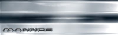
.. i made for a metal themed comp. not sure if it looks too plastic
-
sorry, it looks okay, bit way to plastic 
_____________

_______Life With A Smile_______
-
yea it looks a bit plasticy, but the lighting on it is really good.
 My DevART
RATCHET is my bitch
Andrew says:
u ever stolen a bible?
Apathy says:
no
used the last two pages to roll a joint though
Andrew says:
wow
thats fucking hard core
^^HAHAHA, dm sucks XD
-
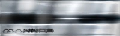
i thought so, cheers guys
might have to add some scratches to it or sumit
-
tweaked the lighting a bit to try and make it look more metalic. some comments/advice would be much appreciated
-
i liked it better the first way, even if it does look a bit plasticy still looks cool.
My DevART
RATCHET is my bitch
Andrew says:
u ever stolen a bible?
Apathy says:
no
used the last two pages to roll a joint though
Andrew says:
wow
thats fucking hard core
^^HAHAHA, dm sucks XD
-
-
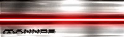
well i cant do much about the text coz i sort of forgot to save the PSD, so i have to do the best i can with a flat pic 
your spot on right with the lighting thing, so i've just deleted that bit, and played with the original again. any more comments would be cool, coz i want to make this as metal looking as i can 
i dont know what the lazer thing is ment to be, but it seems to help with the lighting a bit
-
Ok, that looks great! It looks a lot like real metal - I just don't like the text
-konfusion
-
not much i can do about that im affraid
no PSD, no proper editing
Similar Threads
-
By Freak in forum Sigs & Manips
Replies: 4
Last Post: 10-05-2005, 10:34 PM
-
By Nightfire in forum Sigs & Manips
Replies: 13
Last Post: 09-14-2005, 10:42 PM
-
By BadLilWolfGirl in forum Sigs & Manips
Replies: 2
Last Post: 07-31-2005, 12:18 PM
-
By Samuel in forum Digital Art
Replies: 14
Last Post: 05-09-2005, 11:21 AM
-
By SeasonalWeasel in forum Sigs & Manips
Replies: 10
Last Post: 04-10-2005, 04:22 PM
 Posting Permissions
- You may not post new threads
- You may not post replies
- You may not post attachments
- You may not edit your posts
-
Forum Rules
|


 Reply With Quote


![[PHXN] New001's Avatar](image.php?s=a993f4ac31a4c71ed5ace1ab0a937d0b&u=7015&dateline=1264038258)
![Send a message via Yahoo to [PHXN] New001](http://www.gfxvoid.com/forums/images/misc/im_yahoo.gif)


