0 members and 1,212 guests
No Members online

» Site Navigation

» Stats
Members: 35,443
Threads: 103,072
Posts: 826,684
Top Poster: cc.RadillacVIII (7,429)
|
-
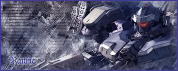
 My first sig posted here :) My first sig posted here :)
Well, I'm new to graphics. I have only had it for about 3 months now, and I'm loving it  My sigs started off with just, brushing a backround, adding a render, and splashing some colour on top & finally finishing it with a border. Now I add more effects, I'm not saying there very good, but I prefer them than the last of my sigs My sigs started off with just, brushing a backround, adding a render, and splashing some colour on top & finally finishing it with a border. Now I add more effects, I'm not saying there very good, but I prefer them than the last of my sigs
Now, I'm not happy with the text, as I just realized that I had forgotten to put in the text after uploading it, so I had to rush it a bit.
It's not great, but, well you need to start somewhere right? Comments & advice appreciated !
-
well there ok, kinda. for a start there monotoned. Wich usually doesnt look good. The dotted texture on teh top one should be put at a lower opacity its pretty distracting. The borders on teh aren't that great either i'd just stick with teh regular 1 px black border. and also as u said the text isnt very good. but keep working at it. I'd check out some tuts here and those will help you get better.
 My DevART
RATCHET is my bitch
Andrew says:
u ever stolen a bible?
Apathy says:
no
used the last two pages to roll a joint though
Andrew says:
wow
thats fucking hard core
^^HAHAHA, dm sucks XD
-
 Originally Posted by paparoksguitar

for a start there monotoned. Wich usually doesnt look good.
Well I like monotone stuff lol
As mentioned by PRG the dotted pattern needs to be on a lower opacity so that it's visible but not really distracting. Maybe brighten up the mech a bit so that it shines and adds a little more flair. As for the border, I'd use a 1 px black border. Go and gander at the tuts and see if you can learn a thing or two. Experiment with the effects here and there, add your own touch to the tut's result.
XBOX Live Gamertag: Merc 106

-
Try using simple stock texts, it usually works. If it needs refining, you can always work on the text yourself (ie put effects on it yourself).
-konfusion
-
Thanks for the advice I'll put them into practice into a bit and I'll post another sig up later.
-
I made another one
Name: Billy joe armstrong
Notes: There is a border there :P Can't see it due to that fact that its WHITE! argh
Note great, I did a bit of the pattern on the render on purpose to see what its result would look like. It's lacking a few things though.

-
The render looks way out in comparison to the back ground. I think you're having trouble with your text a bit too. This may help you in that area.
http://www.gfxvoid.com/forums/showthread.php?t=24396
 Thanks.
Prick.
-
I don't like teh scan lines over billie joe much. The font color isnt working with taht sig. Id also try to use different bg's otehr than just brushes. try combining stock images or otehr things of that sort. C4d's are a nice substitue if you really liek brushes.
My DevART
RATCHET is my bitch
Andrew says:
u ever stolen a bible?
Apathy says:
no
used the last two pages to roll a joint though
Andrew says:
wow
thats fucking hard core
^^HAHAHA, dm sucks XD
Similar Threads
-
By C4E in forum Sigs & Manips
Replies: 6
Last Post: 03-20-2007, 04:32 PM
-
By DevilBoySVT in forum Sigs & Manips
Replies: 17
Last Post: 02-04-2005, 12:02 AM
 Posting Permissions
- You may not post new threads
- You may not post replies
- You may not post attachments
- You may not edit your posts
-
Forum Rules
|


 Reply With Quote


