0 members and 517 guests
No Members online

» Site Navigation

» Stats
Members: 35,443
Threads: 103,072
Posts: 826,684
Top Poster: cc.RadillacVIII (7,429)
|
-
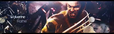
 newironman newironman

c&c please.
-
vry nice, much better than i can do. but the render looks a bit squashed to me")
-
Pretty killer... but the text seems a bit too unnoticable
Fave:
~~-Gift from a friend-~~
-
Ronin, this is your best one yet! Nice job; render is blended nicely, effects are pretty cool, I even like the text! Only issue I got is I dont much like the border, and Iron Man does seem kinda squashed. Not bad though, Keep at it, youre definitely improving!
-
thanx guys, i really appriciate the comments. i think its cuz half his head is cut off thats why it seems squashed.
-
Yea Really looks good man nice job. By far your best.. id current it. The text is really good, i think its good its not that noticable, doesnt take away from teh sig.
 My DevART
RATCHET is my bitch
Andrew says:
u ever stolen a bible?
Apathy says:
no
used the last two pages to roll a joint though
Andrew says:
wow
thats fucking hard core
^^HAHAHA, dm sucks XD
-
Doesn't look squashed to me. Border needs to be fixed. Change the border or just remove it. Other than that, I love the sig.
-
Nice job! I don't think it looks squashed either. But change that border and you rolling
-
Excellent text, nice work - just please make it a 1pix border 
-konfusion
-
lol thanx guys, i like borders for some reason.
 Posting Permissions
- You may not post new threads
- You may not post replies
- You may not post attachments
- You may not edit your posts
-
Forum Rules
|


 Reply With Quote