GFXVoid Graphic Design Forum

Remove Text Formatting
Loading...

» Online Users: 3,992

0 members and 3,992 guests
No Members online

» Site Navigation

 > FAQ

» Stats

Members: 35,443
Threads: 103,072
Posts: 826,684
Top Poster: cc.RadillacVIII (7,429)
Welcome to our newest member, Lekelindids
Results 1 to 5 of 5

Thread: Ore

  1. #1
    Join Date
    Mar 2007
    Posts
    29

    Default Ore

    Ore


    one of my best i think


    What You expect?
    Condems?

  2. #2
    Join Date
    Mar 2007
    Location
    Duisburg, Germany
    Posts
    200

    Default

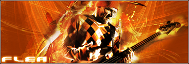
    not bad^^ the BG is alright so is the text. the render needs blending and lighting.
    current:

    fav:


  3. #3
    Join Date
    Mar 2007
    Posts
    29

    Default


    hows that?


    What You expect?
    Condems?

  4. #4
    Join Date
    Jun 2005
    Location
    The Schwa, Ontario, Canada
    Posts
    1,324

    Default

    It seems too busy and the render still seems too out of place. Also, there's a lack of a true border

  5. #5
    Join Date
    Mar 2007
    Location
    MA of the US
    Posts
    354

    Default

    Sweet man. I love the vt sign. I don't see anything wrong with the border though, I kinda like the widescreen for this sig.
    Fave:

    ~~-Gift from a friend-~~

Posting Permissions

  • You may not post new threads
  • You may not post replies
  • You may not post attachments
  • You may not edit your posts
  •  
Powered by vBadvanced CMPS v4.1.1