0 members and 5,068 guests
No Members online

» Site Navigation

» Stats
Members: 35,443
Threads: 103,072
Posts: 826,684
Top Poster: cc.RadillacVIII (7,429)
|
-
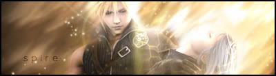
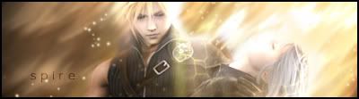
 Advent Children Advent Children
v1:
v2:
hints? tips?
i think i may have brushed a little too much..
Last edited by s0ggywaffls; 04-12-2007 at 05:12 PM.
-
overall, I like. Only things: BG could use a bit more than just smudge +/or brushing. The lighting, at first glance, I loved, but it doesnt follow the 'flow' of the sig. Like, the BG is going diagonally, the lighting is like straight down, thru Cloud. If you could turn the lighting the same angle, and add to the BG, this would be sweet.
-
thnx for the tips!
anyway, i was planning on entering a SotW with one of them(not gfx sotw...it wouldnt stand a chance!) on a different forum. which one do you think would be better for a sotw entry?
-
v1
I like it, nice warm colors, good effects and blending. Lighting is pretty good. Text could be better, but its alright.
-
There's really not much difference between the two, but I think both are superb! I think the lighting look alright, although you could tweak it a bit. Perfect text too!
-
Pretty nice but it would look much better if it were cleaned up and flowed a little better. I'd experiment with the text as well.
This is me.

-
i think it was nice maybe the bg is a bit simple, but the text is good catch the final fantasy render nice gj
Similar Threads
-
By Mr Toasty in forum Sigs & Manips
Replies: 6
Last Post: 09-06-2005, 11:56 AM
-
By Chemical in forum Sigs & Manips
Replies: 10
Last Post: 08-10-2005, 06:28 PM
-
By Daemon_ in forum Sigs & Manips
Replies: 4
Last Post: 03-18-2005, 06:44 PM
 Posting Permissions
- You may not post new threads
- You may not post replies
- You may not post attachments
- You may not edit your posts
-
Forum Rules
|


 Reply With Quote


