0 members and 5,995 guests
No Members online

» Site Navigation

» Stats
Members: 35,443
Threads: 103,072
Posts: 826,684
Top Poster: cc.RadillacVIII (7,429)
|
-
-

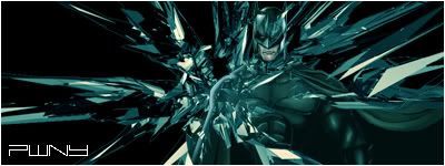
i think the text is too sharp
at first glance it just looks like a c4d slapped on a black bg, but i guess its just overlapping
Last edited by s0ggywaffls; 04-12-2007 at 06:04 PM.
-
Put more into it, right now it seems like a batman render, underneath a C4D render. It needs a background, and some other effects. Also, i think it would look better if you didnt have quite so much of the c4d render on top of the batman one, it makes it hard to find him/the focal point.
Keep working at it, read some tutorials.
-
I love how the c4d wraps around Bats on the left(his right) side, but I think it covers him too much on his face and right(his left) side. Also, the light blue line(I guess an outline on Bats side; our left, his right), should go away. And the text is a tad sharp, also maybe use the color from the sig, instead of white.
-
Henry's right, you just need a real subtle, real dark background and some erasing here and there to make it much better.
-
Try to do something more with it and get rid of the plain white bg. It is a little too plain right now. Mess around with different ways of coloring instead of making it so monotone.
This is me.

-
yeah i like the colors and the text, but there seems to be to much around batman head its hard to tell which is hi and the effect.
Similar Threads
-
By mannos in forum Sigs & Manips
Replies: 2
Last Post: 08-04-2006, 07:12 PM
-
By DragonsRage in forum Sigs & Manips
Replies: 1
Last Post: 09-26-2005, 04:27 PM
-
By hellz in forum Sigs & Manips
Replies: 9
Last Post: 07-06-2005, 06:57 AM
-
By B][G K in forum Sigs & Manips
Replies: 1
Last Post: 04-02-2005, 03:28 AM
 Posting Permissions
- You may not post new threads
- You may not post replies
- You may not post attachments
- You may not edit your posts
-
Forum Rules
|


 Reply With Quote


