GFXVoid Graphic Design Forum

Remove Text Formatting
Loading...

» Online Users: 3,690

0 members and 3,690 guests
No Members online

» Site Navigation

 > FAQ

» Stats

Members: 35,443
Threads: 103,072
Posts: 826,684
Top Poster: cc.RadillacVIII (7,429)
Welcome to our newest member, Lekelindids
Results 1 to 7 of 7

Thread: Sean poul

  1. #1
    Join Date
    Mar 2007
    Location
    Denmark
    Posts
    4,197

    Default Sean poul

    what you guys/girls ;p think?


  2. #2
    Join Date
    Mar 2007
    Location
    Cali
    Posts
    372

    Default

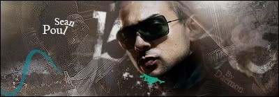
    thats pretty cool, just take that blue thing off, it looks like a wierd gotee.

  3. #3
    Join Date
    Feb 2005
    Posts
    2,921

    Default

    spelt paul not poul.

    And I agree with the green.

  4. #4
    Join Date
    Dec 2006
    Location
    Pittsburgh PA
    Posts
    152

    Default

    i like it...needs a smidgen of depth though over all very nice work
    Throughout life advance daily, becoming more skillfull than yesterday, more skillfull than today...this is neverending...Hagakure


  5. #5
    Join Date
    Mar 2005
    Location
    Toronto
    Posts
    2,079

    Default

    those teal and blue parts dont work with the monotonus background as it is, and that background needs a little more depth, give it that 3d factor.


  6. #6
    Join Date
    Mar 2007
    Location
    Denmark
    Posts
    4,197

    Default

    thx all for the god advise i will remake the Poul, and try to get some more depth to it, and then erase those green things


  7. #7
    Join Date
    Mar 2007
    Location
    Duisburg, Germany
    Posts
    200

    Default

    agreed. the green must leave. and the left side is a b it plain. cool otherwise.
    current:

    fav:


Posting Permissions

  • You may not post new threads
  • You may not post replies
  • You may not post attachments
  • You may not edit your posts
  •  
Powered by vBadvanced CMPS v4.1.1