GFXVoid Graphic Design Forum

Remove Text Formatting
Loading...

» Online Users: 8,167

0 members and 8,167 guests
No Members online

» Site Navigation

 > FAQ

» Stats

Members: 35,443
Threads: 103,072
Posts: 826,684
Top Poster: cc.RadillacVIII (7,429)
Welcome to our newest member, Lekelindids
Page 2 of 6 FirstFirst 1234 ... LastLast
Results 11 to 20 of 57
  1. #11
    Join Date
    Feb 2006
    Posts
    2,688

    Default


    My entry ^_^

  2. #12
    Join Date
    Mar 2007
    Location
    Cali
    Posts
    372

    Default

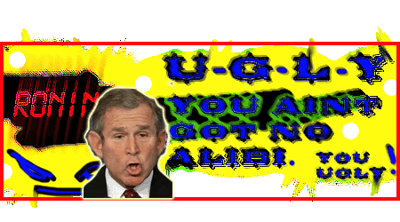
    heres mine, i worked very hard on this one. lol.

    Last edited by RONIN; 04-16-2007 at 02:04 AM.
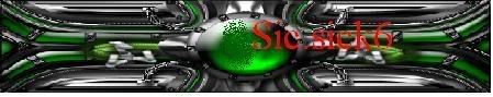
  3. #13
    Join Date
    Feb 2007
    Location
    Maldives
    Posts
    461

    Default


    here's mine...


    You Are 66% Evil


    You are very evil. And you're too evil to care.
    Those who love you probably also fear you. A lot.

    How Evil Are You?

    http://www.blogthings.com/howevilareyouquiz/

  4. #14
    Join Date
    Mar 2007
    Location
    Northport, AL USA
    Posts
    264

    Default

    I think the idea is for you to make your own, not just take prg's sig and put your text on it.

  5. #15
    Join Date
    May 2006
    Posts
    1,729

    Default

    Quote Originally Posted by LoganGFX View Post
    I think the idea is for you to make your own, not just take prg's sig and put your text on it.
    i think he was making a statement hahahaha

  6. #16
    Join Date
    Dec 2006
    Posts
    702

    Default

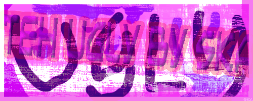
    There's ugly. Then there's ugly-ugly.
    Then there's this:

    -konfusion

  7. #17
    Join Date
    Apr 2007
    Location
    UK
    Posts
    484

    Default

    welll you call that ugly there's that and then there's Choppy text boarder's brushes and hoohaa!

    So here it is not for the weak of grafic heart...Yaaaar sheee Blowwsss!


    (btw i think Kon fusion is overweight on the ugly!)


    [((_CRAYOLA_((]>[((_CRAYOLA_((]>[((_CRAYOLA_((]>[((_CRAYOLA_((]>[((_CRAYOLA_((]>[((_CRAYOLA_((]>

  8. #18
    Join Date
    Dec 2006
    Posts
    702

    Default

    I was going to leave her boob, but I covered it up with an ugly brush xD
    Mine is not for the graphically unstable

    -konfusion

  9. #19
    Join Date
    Apr 2007
    Location
    UK
    Posts
    484

    Default

    Quote Originally Posted by konfusion View Post
    I was going to leave her boob, but I covered it up with an ugly brush xD
    Mine is not for the graphically unstable

    -konfusion

    the brush is uglier than the boob it's star shape and i hope that isnt set on dissolve other wise thing's just got uglier


    [((_CRAYOLA_((]>[((_CRAYOLA_((]>[((_CRAYOLA_((]>[((_CRAYOLA_((]>[((_CRAYOLA_((]>[((_CRAYOLA_((]>

  10. #20
    Join Date
    Feb 2005
    Posts
    2,921

    Default

    It was originally just going to be a picture of henry, but I got bored and made it look sexier.


Similar Threads

  1. Ugliest Signature CONTEST:
    By Juicy in forum Member Battles Voting
    Replies: 23
    Last Post: 07-24-2005, 05:40 PM

Posting Permissions

  • You may not post new threads
  • You may not post replies
  • You may not post attachments
  • You may not edit your posts
  •  
Powered by vBadvanced CMPS v4.1.1