GFXVoid Graphic Design Forum

Remove Text Formatting
Loading...

» Online Users: 1,641

0 members and 1,641 guests
No Members online

» Site Navigation

 > FAQ

» Stats

Members: 35,443
Threads: 103,072
Posts: 826,684
Top Poster: cc.RadillacVIII (7,429)
Welcome to our newest member, Lekelindids
Results 1 to 9 of 9
  1. #1
    Join Date
    Apr 2007
    Location
    lurking outside your window
    Posts
    124

    Default eh, I don't like how this sig turned out..


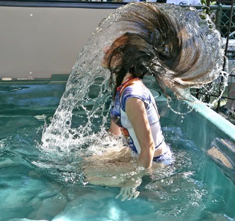
    bleh. any suggestions? I just want to make something with this picture:


    It's me from a couple years ago and I always liked it and now that I can make not 100%-crappy (though still not great) sigs, I thought I'd try something. :\

    Thanks..

  2. #2

    Default

    Experimenting and getting away from using renders is good. Its the only way to improve, keep it up. As far as suggestions I dont really have any, just mess around with filters and smudging techniques.
    Awesome photo too, I always love photos that have to do with water.

  3. #3
    Join Date
    Mar 2007
    Location
    MA of the US
    Posts
    354

    Default

    Wow actually pretty good! I really like it... it's just so vibrant.
    Fave:

    ~~-Gift from a friend-~~

  4. #4
    Join Date
    Aug 2006
    Location
    Vancouver
    Posts
    4,948

    Default

    I think it's cool. It's a bit big, and so's your text though.


    Thanks.
    Prick.


  5. #5
    Join Date
    Nov 2006
    Location
    Sweden, Linkoping
    Posts
    129

    Default

    I dont know if you want to listen to me since i suck at making sigs, just look at the one i have now (lol).
    But i think that you should try giving the part in front of her face the same blue tone as everything else and maybe sharpen that part extra much or something.
    otherwise really cool photo and sig! good job .

  6. #6
    Join Date
    Apr 2007
    Location
    lurking outside your window
    Posts
    124

    Default

    meh. I've always sort of sucked at renders. mainly because I haven't the slightest clue what to do with them...

    so I tried adding a blue-ish-green tint and making the text smaller. I also cropped the bottom by 10 pixels, but that's not really that noticeable.


    hm, maybe the blue-ish-green tint is too dark.. opinions? =\

  7. #7
    Join Date
    Aug 2006
    Location
    Vancouver
    Posts
    4,948

    Default


    Thanks.
    Prick.


  8. #8
    Join Date
    Apr 2007
    Location
    lurking outside your window
    Posts
    124

    Default

    eh.. I like how I do my text. Thanks though. ^^

    and my extremely large collection of downloaded fonts = <3 xP I started it a year ago when I got Photoshop and it just keeps growing somehow. XD

  9. #9
    Join Date
    Nov 2006
    Location
    Sweden, Linkoping
    Posts
    129

    Default

    I like it even more with the blue tint .

Similar Threads

  1. Dragon thingy... Turned out ok.
    By PREDATOR. in forum Sigs & Manips
    Replies: 12
    Last Post: 02-14-2007, 03:39 PM

Posting Permissions

  • You may not post new threads
  • You may not post replies
  • You may not post attachments
  • You may not edit your posts
  •  
Powered by vBadvanced CMPS v4.1.1