GFXVoid Graphic Design Forum

Remove Text Formatting
Loading...

» Online Users: 947

0 members and 947 guests
No Members online

» Site Navigation

 > FAQ

» Stats

Members: 35,443
Threads: 103,072
Posts: 826,684
Top Poster: cc.RadillacVIII (7,429)
Welcome to our newest member, Lekelindids
Results 1 to 4 of 4
  1. #1
    Join Date
    Feb 2007
    Location
    American by birth, southern by the grace of God.
    Posts
    2,564

    Default New Sig nothing good


    C+C nothing good but yeah

  2. #2
    Join Date
    Nov 2006
    Location
    Sweden, Linkoping
    Posts
    129

    Default

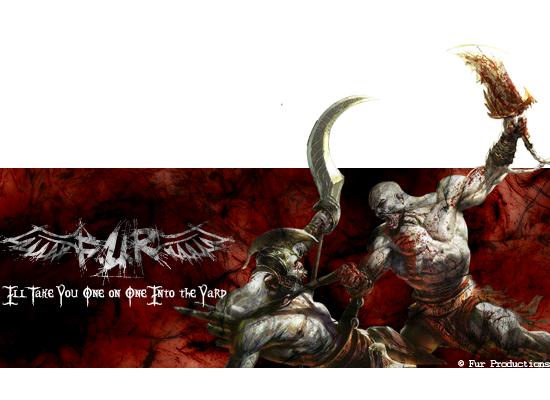
    Its big and bloody awesome ^^.
    maybe its a tad to big and i like the subtext font, it totally matches the mood of the sig but its not that well blended with the rest of the image, maybe try blend it in more?

  3. #3
    Join Date
    Mar 2007
    Location
    Denmark
    Posts
    4,197

    Default

    hmm i like the render but i dont like the bg looks like you just brushed some on a red bg


  4. #4
    Join Date
    Apr 2007
    Location
    Kuwait lol
    Posts
    76

    Default

    i think it looks good. the soft light in the BG is cool. kinda big for a sig. still its cool

Similar Threads

  1. Good mornin, good evnin and goodnite
    By stev0 in forum Introductions
    Replies: 2
    Last Post: 03-17-2007, 03:16 AM
  2. i new sig that might not be that good
    By SpartanX in forum Sigs & Manips
    Replies: 4
    Last Post: 01-31-2007, 04:45 PM
  3. Good or very bad?
    By Sumomo in forum Sigs & Manips
    Replies: 5
    Last Post: 02-27-2006, 11:11 PM
  4. is it good?
    By Surfaced in forum Sigs & Manips
    Replies: 2
    Last Post: 07-25-2005, 02:05 PM
  5. y its good
    By half-life man in forum The Void
    Replies: 4
    Last Post: 04-26-2005, 11:48 AM

Posting Permissions

  • You may not post new threads
  • You may not post replies
  • You may not post attachments
  • You may not edit your posts
  •  
Powered by vBadvanced CMPS v4.1.1