GFXVoid Graphic Design Forum

Remove Text Formatting
Loading...

» Online Users: 3,966

0 members and 3,966 guests
No Members online

» Site Navigation

 > FAQ

» Stats

Members: 35,443
Threads: 103,072
Posts: 826,684
Top Poster: cc.RadillacVIII (7,429)
Welcome to our newest member, Lekelindids
Results 1 to 3 of 3

Thread: Ore

  1. #1
    Join Date
    Mar 2007
    Posts
    29

    Default Ore


    CnC please


    What You expect?
    Condems?

  2. #2
    Join Date
    Apr 2007
    Location
    lurking outside your window
    Posts
    124

    Default

    It looks good. I think it becomes too dark too quickly on the left. but other than that, good. =D

    btw, anytime I see "BillyShears", I always think it says Brittney Spears. xP
    Last edited by pearlized; 05-16-2007 at 10:40 PM. Reason: wanted to add something else

  3. #3

    Default

    Text needs a little changing, doesnt really fit the sig in my opinion.
    As pearlized said, seems to get dark too quickly on the left.
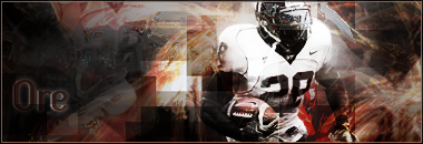
    I think it would look better with it being a little brighter around the stock, not really bright but something to make it grab your attention. Brighter around particularly the lower region of him and his right arm (the one holding the ball).

Posting Permissions

  • You may not post new threads
  • You may not post replies
  • You may not post attachments
  • You may not edit your posts
  •  
Powered by vBadvanced CMPS v4.1.1