GFXVoid Graphic Design Forum

Remove Text Formatting
Loading...

» Online Users: 2,074

0 members and 2,074 guests
No Members online

» Site Navigation

 > FAQ

» Stats

Members: 35,443
Threads: 103,072
Posts: 826,684
Top Poster: cc.RadillacVIII (7,429)
Welcome to our newest member, Lekelindids
Results 1 to 5 of 5

Thread: More Zelda. lol

  1. #1
    Join Date
    Nov 2006
    Posts
    188

    Default More Zelda. lol


    I like this one.

    CnC, please.
    Death becomes us all.

  2. #2
    Join Date
    Mar 2007
    Location
    MA of the US
    Posts
    354

    Default

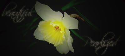
    Nice job, the text is kinda oddly spaced though.
    Fave:

    ~~-Gift from a friend-~~

  3. #3
    Join Date
    May 2006
    Posts
    1,729

    Default

    looks nice, but I think link could stand out a bit more.
    Last edited by Jeff; 05-19-2007 at 12:59 PM.

  4. #4
    Join Date
    Apr 2007
    Location
    lurking outside your window
    Posts
    124

    Default

    it's kind of pastel-y. it's nice & soft. I like it.

    I didn't even see the text until I looked for it though. xP maybe bring it down a bit so the w and t don't blend in so much?

  5. #5
    Join Date
    Jun 2006
    Posts
    1,237

    Default

    I really like it, although I agree with jsoosiah, link could stand out a bit more.


Similar Threads

  1. zelda
    By RONIN in forum Sigs & Manips
    Replies: 1
    Last Post: 04-20-2007, 12:51 PM
  2. ^zelda^
    By sunshiine in forum Sigs & Manips
    Replies: 12
    Last Post: 03-16-2007, 12:35 PM
  3. Zelda
    By bAy in forum Sigs & Manips
    Replies: 2
    Last Post: 12-05-2006, 05:22 PM
  4. zelda sig
    By Dark_Angel in forum Sigs & Manips
    Replies: 3
    Last Post: 12-04-2005, 03:24 PM
  5. zelda
    By Chemical in forum Sigs & Manips
    Replies: 4
    Last Post: 06-27-2005, 02:38 PM

Posting Permissions

  • You may not post new threads
  • You may not post replies
  • You may not post attachments
  • You may not edit your posts
  •  
Powered by vBadvanced CMPS v4.1.1