GFXVoid Graphic Design Forum

Remove Text Formatting
Loading...

» Online Users: 8,418

0 members and 8,418 guests
No Members online

» Site Navigation

 > FAQ

» Stats

Members: 35,443
Threads: 103,072
Posts: 826,684
Top Poster: cc.RadillacVIII (7,429)
Welcome to our newest member, Lekelindids
Results 1 to 3 of 3

Thread: Starcraft 2

  1. #1
    Join Date
    May 2007
    Location
    Canada
    Posts
    8

    Default Starcraft 2

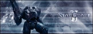
    now im pretty new to this program still only for about two months now. so here are two versions of the sig.please rate and tell me what you think i could do to make them better.


  2. #2
    Join Date
    Mar 2007
    Location
    Northport, AL USA
    Posts
    264

    Default

    not bad for where you're at with PS. The first ones too monotone(one color), so I'd try working on the second one. Try adding some of the colors to the right side. Another tip for future reference, is try making the render(in this case, the soldier) bigger. Also, try making the pixel stretch you did in the bg less obvious.

  3. #3
    Join Date
    Mar 2007
    Location
    Denmark
    Posts
    4,197

    Default

    what logan said and maybe blend the render more.


Similar Threads

  1. Starcraft 2!
    By Adam in forum The Void
    Replies: 7
    Last Post: 05-20-2007, 12:44 PM
  2. New Starcraft?
    By Bradley in forum The Void
    Replies: 8
    Last Post: 05-10-2007, 08:27 PM
  3. Another Starcraft Sig
    By CrazyGamer in forum Sigs & Manips
    Replies: 4
    Last Post: 08-01-2005, 01:58 AM
  4. Starcraft Hydralisk
    By Twan in forum Sigs & Manips
    Replies: 5
    Last Post: 05-10-2005, 04:01 PM
  5. Starcraft wallpaper
    By Morphius in forum Digital Art
    Replies: 4
    Last Post: 02-05-2005, 12:11 PM

Posting Permissions

  • You may not post new threads
  • You may not post replies
  • You may not post attachments
  • You may not edit your posts
  •  
Powered by vBadvanced CMPS v4.1.1