GFXVoid Graphic Design Forum

Remove Text Formatting
Loading...

» Online Users: 515

0 members and 515 guests
No Members online

» Site Navigation

 > FAQ

» Stats

Members: 35,443
Threads: 103,072
Posts: 826,684
Top Poster: cc.RadillacVIII (7,429)
Welcome to our newest member, Lekelindids
Results 1 to 4 of 4

Thread: New Sig

  1. #1
    Join Date
    Feb 2007
    Location
    American by birth, southern by the grace of God.
    Posts
    2,564

    Default New Sig

    ok rember im still learning, but here it is C+C.

  2. #2

    Default

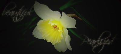
    Looks as if the render is out of proportion a little. Hold shift when you are resizing the render so it keeps the ratios.
    The whole sig needs more than one color put into it, I'm not too fond of monotonous toned sigs.
    Work on blending the render. Looking at any tuts? There should be a few good ones here that have the basics of blending.
    Keep it up.

  3. #3
    Join Date
    Feb 2007
    Location
    Nottingham, UK
    Posts
    149

    Default

    IF using transform, press ALT+SHIFT, it does some cool thing where the ratios are adjusted centred, saves having to drag the image back into the sig when it shrinks off into one corner.


    If You're not A Filter-Monkey, Copy this into your sig!


  4. #4
    Join Date
    Apr 2007
    Location
    lurking outside your window
    Posts
    124

    Default

    She's squashed. and that bothers me a lot.

Posting Permissions

  • You may not post new threads
  • You may not post replies
  • You may not post attachments
  • You may not edit your posts
  •  
Powered by vBadvanced CMPS v4.1.1