0 members and 798 guests
No Members online

» Site Navigation

» Stats
Members: 35,443
Threads: 103,072
Posts: 826,684
Top Poster: cc.RadillacVIII (7,429)
|
-
-

 Originally Posted by VoodooGypsy

I gave it a go, went through it all and then started messing around on my own. Love how you leave room for the person's own creativity.
Here is my result:

Nice outcome looks like dawn. thx for giving it a try
Originally Posted by Bill-Kill
Well, I didn't like some of the steps, but I followed them all just to see the final result I would get with it, so here is what I turned out with:
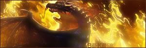
I can see you really used the liquify filter effect, i think this is a great outcome, looks like fire.
Nice tut by the way 
Originally Posted by Igelkotten
my outcome :P
Also like this one showas that the tut not only can be done in a light way nice job.
-
-
here is mine :-D love the tut easy to follow
-
-
ya, its looks very nice, but u didnt rezise it very well, the render looks "fat".
the effect is good tho :
-
the stock picture is a little fat to
-
Originally Posted by Fur
the stock picture is a little fat to
Thx did you remember to hold SHIFT while re-size?
-
yes I did im not that bad anymore :-D
-
Similar Threads
-
By Etitan in forum Sigs & Manips
Replies: 4
Last Post: 06-06-2006, 05:35 PM
-
By Oldeback in forum Digital Art
Replies: 6
Last Post: 05-26-2006, 01:16 AM
-
By Flip in forum Digital Art
Replies: 1
Last Post: 02-10-2006, 09:27 PM
-
By AntidotexXx in forum Sigs & Manips
Replies: 12
Last Post: 12-08-2005, 10:35 AM
-
By jerner in forum Digital Art
Replies: 30
Last Post: 03-18-2005, 02:28 PM
 Posting Permissions
- You may not post new threads
- You may not post replies
- You may not post attachments
- You may not edit your posts
-
Forum Rules
|


 Reply With Quote