0 members and 1,043 guests
No Members online

» Site Navigation

» Stats
Members: 35,443
Threads: 103,072
Posts: 826,684
Top Poster: cc.RadillacVIII (7,429)
|
-
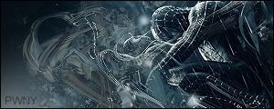
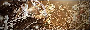
 My Best Creations - Im Still Novice! My Best Creations - Im Still Novice!


I made all of these, from scratch, using my own effects, C&C please!
-
They are a bit too big imo and the backgrounds are a bit boring and repetitive. I also cannot see what is in the first sig all too well. Text also needs some work. But since these are some of your first sigs they are pretty good, and are most likely better than my first couple of sigs.
-
Lose the texture and the brick wall things.
Latest:

-
-
 Originally Posted by Pwny

I know this isn't nice at all, but I really don't like them at all.
C-o-n-s-t-r-u-c-t-i-v-e C-r-i-t-i-c-i-s-m
To the point:
As stated above, your sigs are a bit big and repetitive. You should work on the placement of the text and you could try to bring out the text more, to make it easy to read.
-
yearh they are kinda big, and the textures over the renders make us loose the focal point, i say remove texture from renders dont make them to unvisible and then blend them in, its okay for your first try. keep up the work
-
ok, thnx for C&C guys, rate this one aswell please

-
Font needs some work still and try to clean up whats covering the render.
-
What program do you use?
The mewtwo sig isnt bad at all if you ask me.
I would say check some more tutorials.
-
I use Photoshop cs2 full version, and thnx for comment mate  I didnt use tut to see do the Mewtwo effect, just blending and some cool smudge brushes I didnt use tut to see do the Mewtwo effect, just blending and some cool smudge brushes
Similar Threads
-
By Viporizer in forum Sigs & Manips
Replies: 5
Last Post: 10-18-2006, 03:41 PM
-
By Flip in forum Digital Art
Replies: 5
Last Post: 07-07-2006, 04:56 PM
-
By zade one in forum Digital Art
Replies: 17
Last Post: 12-28-2005, 09:47 PM
 Posting Permissions
- You may not post new threads
- You may not post replies
- You may not post attachments
- You may not edit your posts
-
Forum Rules
|


 Reply With Quote