GFXVoid Graphic Design Forum

Remove Text Formatting
Loading...

» Online Users: 762

0 members and 762 guests
No Members online

» Site Navigation

 > FAQ

» Stats

Members: 35,443
Threads: 103,072
Posts: 826,684
Top Poster: cc.RadillacVIII (7,429)
Welcome to our newest member, Lekelindids
Page 1 of 2 12 LastLast
Results 1 to 10 of 11

Thread: My new Sig.

  1. #1
    Join Date
    Jun 2007
    Location
    Boxington.
    Posts
    37

    Default My new Sig.

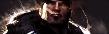
    Hi guys, this is grozny, or w/e my screen name used to be. but i just made this sig. if you guys could give me some C&C or any advice to get some ideas flowing as to making it better i would greatly appreciate it.


    Newerish Version


    yeah i guess it can be hard for other people to know what the render is and stuff, I guess I take it for granted that people know what they are looking at.
    Last edited by MGO; 06-14-2007 at 10:31 AM. Reason: new version of sig

  2. #2
    Join Date
    Mar 2005
    Location
    Toronto
    Posts
    2,079

    Default

    looking not bad, the background give sa nice effect, but i really have no idea what that image is. the text stands out just a wee bit too much. the colours and everything look good though.


  3. #3
    Join Date
    May 2007
    Posts
    495

    Default

    Is that like a computer robot thingy? I like the background a lot.. Maybe make the text just a little bit more transparent, but other than that.. Looks nice..

  4. #4
    Join Date
    Feb 2007
    Location
    Nottingham, UK
    Posts
    149

    Default

    I think it would be better if i knew what the render was supposed to be?


    If You're not A Filter-Monkey, Copy this into your sig!


  5. #5
    Join Date
    Jun 2007
    Location
    Malmö,Sweden.
    Posts
    166

    Default

    I think it's good as it is. The text is perfect and so is the background. Don't know if I'm right but, the render looks like a lamp or something :P .Nice job man.
    Latest:

  6. #6
    Join Date
    Jun 2007
    Location
    Boxington.
    Posts
    37

    Default

    the render looks like a lamp or something :P
    WTF?!

    thanks guys, im gonna go work on a new, better version right now.
    I MISS MGO!


  7. #7
    Join Date
    Feb 2007
    Location
    Maldives
    Posts
    461

    Default

    whoa nice effects int eh bacground... btw can u tell me where u got the render? is that work of a guy called d0rn?


    You Are 66% Evil


    You are very evil. And you're too evil to care.
    Those who love you probably also fear you. A lot.

    How Evil Are You?

    http://www.blogthings.com/howevilareyouquiz/

  8. #8
    Join Date
    Jun 2007
    Location
    Boxington.
    Posts
    37

    Default

    its the robot from the anime/manga of FLCL or Fooley Cooley
    I MISS MGO!


  9. #9

    Default

    so good that u can make a tutorial about it! this site need it.
    Contact me:
    Steam Jakobski
    Messenger cs-zonar@hotmail.com


    My New


    I like Dark


  10. #10
    Join Date
    Jun 2007
    Location
    Malmö,Sweden.
    Posts
    166

    Default

    http://www.planetrenders.net/renders...ls.php?album=1
    Some nice renders to use as backgrounds (:
    Latest:

Posting Permissions

  • You may not post new threads
  • You may not post replies
  • You may not post attachments
  • You may not edit your posts
  •  
Powered by vBadvanced CMPS v4.1.1