0 members and 4,958 guests
No Members online

» Site Navigation

» Stats
Members: 35,443
Threads: 103,072
Posts: 826,684
Top Poster: cc.RadillacVIII (7,429)
|
-
 New Style, surie New Style, surie
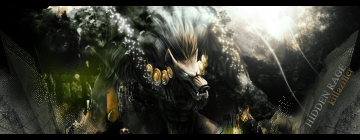
ye, i just tested everthing on this one, so maybe you don't like it ... i made this one with a TUT, a very good tut i learned a lot of that tool, you know tricks and combo's to use to make it looks nice
Here is the Tut site:
http://premium.fileden.com/premium/2...ial%20copy.png
but this is my outcomes...
Version 1:

Version 2

So, wich one do you like the most ?? i think i like V1 , V2 got to much blending.. right ? idk... you tell me.. ok? don't need to rate unless you want to... thanks for your time reading this xD
Peace,
Surie.
-

V2 is too bright D: V1 looks pretty good :3
Try sharpening the focals and blur the background a bit. :x
-
mm i prefer v2, but they both seem to have a low quality finish to them.. i agree with killazilla, try sharpening?
.>current


-
It needs to be sharpened and you shoudl try adding mroe contrast to it as well. Right now it seems kinda foggy and overall a bit un interesteing, but if you sharpen it and add contrast it will liven up teh colors and make it a cool sig.
 My DevART
RATCHET is my bitch
Andrew says:
u ever stolen a bible?
Apathy says:
no
used the last two pages to roll a joint though
Andrew says:
wow
thats fucking hard core
^^HAHAHA, dm sucks XD
-
ok i shall try thnx for the commands
-
Needs more clarity on both.. V2 has too much stuff in it and is too bright.. V1 looks nice but it's kinda' blurry.. Not a bad job though.. 
Similar Threads
-
By Surie in forum Sigs & Manips
Replies: 2
Last Post: 06-26-2007, 09:19 AM
-
By Lord_badass in forum Sigs & Manips
Replies: 7
Last Post: 05-10-2006, 11:33 AM
-
By ilovecoheed in forum Sigs & Manips
Replies: 12
Last Post: 11-13-2005, 02:46 PM
-
By spybrat in forum Sigs & Manips
Replies: 5
Last Post: 10-11-2005, 09:49 AM
-
By dragonlord in forum Sigs & Manips
Replies: 5
Last Post: 09-29-2005, 02:15 PM
 Posting Permissions
- You may not post new threads
- You may not post replies
- You may not post attachments
- You may not edit your posts
-
Forum Rules
|


 Reply With Quote