0 members and 423 guests
No Members online

» Site Navigation

» Stats
Members: 35,443
Threads: 103,072
Posts: 826,684
Top Poster: cc.RadillacVIII (7,429)
|
-
 Robots out of disguise Robots out of disguise
its not much, but i kind of like it
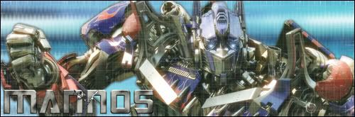
thoughts?
-

Well, I don't really like it. It just doesn't look sharp enough for a Transformer. Usually, I picture them as really shiny robots with nice colours. The colours are the only thing that draws them to me and I think it was made to look like it had a bit less colour in this sig.
Also, the background should be a little more colourful I think. It looks too monotone.
I hope you didn't take it too hard. It has a nice idea but can become better with some extra touches.
(\__/) (='.'=)This is Bunny. Copy and paste bunny into your
(")_(")signature to help him gain world domination.
I think Adobe® Photoshop® is SCARY!
Check out my deviantART page at http://sadzamaker.deviantart.com/
-
hmm.. made optimus a bit blurry on purpose tbh
i'll fix it to see if it looks any better 
-
Yeah, I think the blur dulls down his shine. I think that was what was bothering me about Prime.
(\__/) (='.'=)This is Bunny. Copy and paste bunny into your
(")_(")signature to help him gain world domination.
I think Adobe® Photoshop® is SCARY!
Check out my deviantART page at http://sadzamaker.deviantart.com/
-
Yes I like the shine of the transformers and the dulling takes away from it. But the text is a plus.
-
-
cheers all
most of the work was with the text tbh, everything else was an afterthought. never have been great with abstract backgrounds
well, heres my second attempt

-
-
I like the newer one more just looks a lil better
-
na, i like the first once, cuz of the backround, great work man!
Similar Threads
-
By Mynros in forum Digital Art
Replies: 6
Last Post: 11-25-2005, 01:02 PM
 Posting Permissions
- You may not post new threads
- You may not post replies
- You may not post attachments
- You may not edit your posts
-
Forum Rules
|


 Reply With Quote


![[PHXN] New001's Avatar](image.php?s=e35a8d9343c444b34dee743da08cecb9&u=7015&dateline=1264038258)
![Send a message via AIM to [PHXN] New001](http://www.gfxvoid.com/forums/images/misc/im_aim.gif)
![Send a message via MSN to [PHXN] New001](http://www.gfxvoid.com/forums/images/misc/im_msn.gif)
![Send a message via Yahoo to [PHXN] New001](http://www.gfxvoid.com/forums/images/misc/im_yahoo.gif)


