0 members and 3,518 guests
No Members online

» Site Navigation

» Stats
Members: 35,443
Threads: 103,072
Posts: 826,684
Top Poster: cc.RadillacVIII (7,429)
|
-
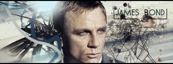
 James Bond James Bond
So its a time since i made a Signature, therefore i decided to create one for the SOTW And this is what i got, ps James Bond is a instrument of destruction. C&C Would be nice.
-
Top left looks almost like a lens flare, but i like the Wire frame'y thing on the right hand side covered by the render and how you placed + made the text the C4D fits weell with the signature, since it sort of reminds me of an explosion, which well belongs with james bond, his face looks very pale though but thats the render anyways definately 9+/10 cant think of where but it looks overall good clean sharp no smudgey, or dirty look on it looks well placed and well thought out.
Newest:

Favorite:

-
 Originally Posted by Grogerian

Top left looks almost like a lens flare, but i like the Wire frame'y thing on the right hand side covered by the render and how you placed + made the text the C4D fits weell with the signature, since it sort of reminds me of an explosion, which well belongs with james bond, his face looks very pale though but thats the render anyways definately 9+/10 cant think of where but it looks overall good clean sharp no smudgey, or dirty look on it looks well placed and well thought out.
Thx for the great comment, I cant agre with it looking like a lense flare? But maybe other thinks that too? anyway great comment thx
-
wow...nice clean....simple looking sig...but I can tell alot of work went into it. ( or i think so anyways ) I love everything about it except for the light source...or the non lense flare thing...other than that almost perfect sig 9.5/10
Latest
First Sig

-
thx for commenting
-
I really like this one but i cannot see your name under the james bond so for that i give it a 9/10
-
Love how the text is in the box but seeing your name is difficult. Great sig 10/10.
-
Okay, thx for that great comment
-
I like the sig a lot just to me the render on the right side just doesnt look right to me.
-
I like it a lot looks really nice. The only thing im not keen on is the blue line on his ear, not sure why though think it could just be me lol But overall looks great, gj
Similar Threads
-
By Papa in forum Sigs & Manips
Replies: 7
Last Post: 02-24-2007, 02:29 PM
-
By Papa in forum Sigs & Manips
Replies: 5
Last Post: 02-18-2007, 07:41 PM
-
By Umbee in forum Sigs & Manips
Replies: 5
Last Post: 09-21-2005, 04:42 PM
-
By Azte¢ in forum Sigs & Manips
Replies: 4
Last Post: 06-10-2005, 07:16 PM
 Posting Permissions
- You may not post new threads
- You may not post replies
- You may not post attachments
- You may not edit your posts
-
Forum Rules
|


 Reply With Quote