going for all original work, no 'borrowed' renders, etc. All made by me.
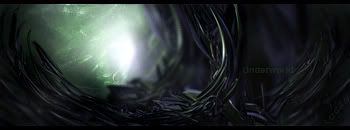
V1:
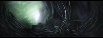
V2:
|
|


Loading...
|
» Online Users: 2,263
|
Results 1 to 4 of 4
Thread: newest
Similar Threads
|


 Reply With Quote