0 members and 3,178 guests
No Members online

» Site Navigation

» Stats
Members: 35,443
Threads: 103,072
Posts: 826,684
Top Poster: cc.RadillacVIII (7,429)
|
-
 Ohhh Man! Its Freedom ^_^ Ohhh Man! Its Freedom ^_^
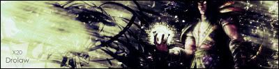
Here we go. Could a little what I have recently learned with some of my own little touches. I did a few of them the past 2 days. I know I should focus a little more of one at a time vs. do one, do another, etc. So any help would be awesome. FYI, adding text is like my Kryptonite. Can't do it no matter what lol. Anyway, C&C. ^_^


-
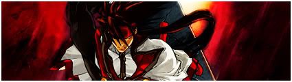
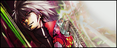
on the first one you need to blend the render and change the text the second I can't say much good for the bg but I like the third one the text fits, blended well and the bg has good colours and flows well good work
-
firstible.... you must to do a blend to render... i really like middle sig bg... also the third sig's bg is great...
-
i actually like how the render sticks out in the first. And its my favourite Of the lot 
-
I like how the render isn't blended into the bg on the first one becuz its a really nice render with great colors. But imo you should lighten up the bg. Also just lower the opacity of the text in the first one. The second is nice could use some more of something though. The third one is the best out of the three imo. Again lower the opacity of the text and both texts i think would look better if they were a bit smaller. Good job though on all three sigs.
-
I'm literally have a smile from ear to ear right now. I feel happy. *happy dance* This is probably the first positive c&c I've ever gotten. *sniff*
In terms of blending for the first, should I just use an eraser on the edges with a soft round brush? or use a different blending mode (hard light, soft light, etc) And for the bg should I maybe add some a brightness and contrast deal to lighten it up or is it something completely different?
For the 2nd could anyone tell me whats missing? I knew I was missing something so that was the whole point of putting it up. ^_^
And 3rd one, smaller font. Got it.
-
 Originally Posted by Scarface04

I like how the render isn't blended into the bg on the first one becuz its a really nice render with great colors. But imo you should lighten up the bg. Also just lower the opacity of the text in the first one. The second is nice could use some more of something though. The third one is the best out of the three imo. Again lower the opacity of the text and both texts i think would look better if they were a bit smaller. Good job though on all three sigs.
Agree with scar, the 1 and 2 sig looks okay. text could use some work but thats always hard. The third sig though really dont fall in my taste. I think the bg is boring and its too filtered.
About the blending question, just use an soft eraser.
-
thats me experimenting with your tuts daemon lol
-
Originally Posted by Freedom
thats me experimenting with your tuts daemon lol
Hehe i realized that and i also like the first 2 but the last you see the ripple lighten effect to much
Similar Threads
-
By Moshiur in forum Digital Art
Replies: 6
Last Post: 12-20-2006, 06:19 AM
-
By Blank_Canvas in forum Digital Art
Replies: 12
Last Post: 01-14-2006, 07:48 PM
-
By Quickdust in forum Digital Art
Replies: 9
Last Post: 10-06-2005, 02:59 PM
-
By Quickdust in forum Digital Art
Replies: 4
Last Post: 09-08-2005, 12:40 PM
-
By Otaku10 in forum Digital Art
Replies: 3
Last Post: 08-29-2005, 11:28 AM
 Posting Permissions
- You may not post new threads
- You may not post replies
- You may not post attachments
- You may not edit your posts
-
Forum Rules
|


 Reply With Quote