0 members and 2,307 guests
No Members online

» Site Navigation

» Stats
Members: 35,443
Threads: 103,072
Posts: 826,684
Top Poster: cc.RadillacVIII (7,429)
|
-
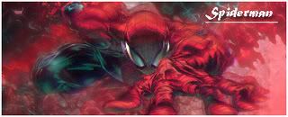
 Päppä and Däemon Sig collab Päppä and Däemon Sig collab
So, Me and pappa was thinking about doing a sig collab, and we both think it turned out pretty need, here is our final result Happy to have worked with you papa. tons of fun. Happy to have worked with you papa. tons of fun.

-
nice, looks good. great job guys.
-
Thx we apreciate you toke the time to comment glad you liked it
-
wow..that is amazing. well done to both of you.
-
it did indeed turn out pretty nice, only thing I dont much care for is the text. But thats tough for most everyone. Yall should do more(collabs, that is)
-
very very nice just the smudge to the left of the text keeps pulling my attentio, to me it stands out a little to much. keep up the good work Daemon
-
 Originally Posted by Fur

very very nice just the smudge to the left of the text keeps pulling my attentio, to me it stands out a little to much. keep up the good work Daemon
Thx for commenting this is papa's work aswell fur
There is no smugde there
-
Not really liking the effects on the right side (just above the render)
And as fur said, the orange thing next to the text is distracting.
Also work some more on the focal, other than that it looks nice :P
-
Yea it came out real good deamon it was nice working with you.
We apriciate the comments a lot guys.
 My DevART
RATCHET is my bitch
Andrew says:
u ever stolen a bible?
Apathy says:
no
used the last two pages to roll a joint though
Andrew says:
wow
thats fucking hard core
^^HAHAHA, dm sucks XD
-
Looks realy realy good
The only thing i notice is the orange blob if u will lol that is drawing my attention to the left of the name
Other then that its realy sweet sig
And btw what/who is that render of?
Similar Threads
-
By Arkanian in forum Sigs & Manips
Replies: 5
Last Post: 08-20-2006, 07:35 PM
-
By Ben in forum Sigs & Manips
Replies: 4
Last Post: 12-27-2005, 02:21 PM
-
By Arkanian in forum Digital Art
Replies: 9
Last Post: 12-19-2005, 12:31 PM
-
By Morphius in forum Digital Art
Replies: 2
Last Post: 08-11-2005, 09:54 AM
 Posting Permissions
- You may not post new threads
- You may not post replies
- You may not post attachments
- You may not edit your posts
-
Forum Rules
|


 Reply With Quote