GFXVoid Graphic Design Forum

Remove Text Formatting
Loading...

» Online Users: 1,864

0 members and 1,864 guests
No Members online

» Site Navigation

 > FAQ

» Stats

Members: 35,443
Threads: 103,072
Posts: 826,684
Top Poster: cc.RadillacVIII (7,429)
Welcome to our newest member, Lekelindids
Results 1 to 8 of 8

Thread: new one

  1. #1
    Join Date
    Jul 2007
    Posts
    417

    Default new one


    CnC plz...

  2. #2
    Join Date
    Mar 2007
    Location
    Denmark
    Posts
    4,197

    Default

    This looks very nice i like it alot. good job current it


  3. #3
    Join Date
    Apr 2007
    Location
    UK
    Posts
    484

    Default

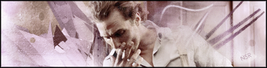
    Overal pretty good but i think theres something up with his arm on the right... Overall pretty good =]


    [((_CRAYOLA_((]>[((_CRAYOLA_((]>[((_CRAYOLA_((]>[((_CRAYOLA_((]>[((_CRAYOLA_((]>[((_CRAYOLA_((]>

  4. #4
    Join Date
    Mar 2005
    Location
    Phoenix, Arizona
    Posts
    113

    Default

    The colors blend very nicely. Good Job. As Skatanic said the right shoulder looks a little weird..

  5. #5
    Join Date
    Jun 2007
    Posts
    129

    Default

    Very nice sig I don't see anything bad about it. Nice job
    :Latest:
    :Favorite:

  6. #6
    Join Date
    May 2006
    Location
    Canada
    Posts
    556

    Default

    lol its pretty cool. but, smoking is bad for you !! tisk tisk


  7. #7
    Join Date
    Jul 2007
    Posts
    417

    Default

    rofl, thanx for the comment...
    And wats wrong with his arm?

  8. #8
    Join Date
    Nov 2006
    Location
    England
    Posts
    84

    Default

    looks good, I see what they saying about the arm, looks like uve faded it and brushed over it aswell which makes it look a little odd.
    Apart from that its great, gj.
    Newest:
    Favourite:

Posting Permissions

  • You may not post new threads
  • You may not post replies
  • You may not post attachments
  • You may not edit your posts
  •  
Powered by vBadvanced CMPS v4.1.1