GFXVoid Graphic Design Forum

Remove Text Formatting
Loading...

» Online Users: 662

0 members and 662 guests
No Members online

» Site Navigation

 > FAQ

» Stats

Members: 35,443
Threads: 103,072
Posts: 826,684
Top Poster: cc.RadillacVIII (7,429)
Welcome to our newest member, Lekelindids
Results 1 to 4 of 4

Thread: Ichigo Kurosaki

  1. #1
    Join Date
    Jun 2007
    Posts
    129

    Default Ichigo Kurosaki

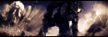
    I can't sleep got bored decided to make a sig. CnC plz

    I didn't really do the lighting well because the left side is dark but the darkness just stops when it should have gradually stopped but I'm not sure how I can do that so tips on that would be nice.

    Last edited by Trikato; 08-10-2007 at 01:57 AM.
    :Latest:
    :Favorite:

  2. #2

    Default

    like u said about the lighting needs work and the text can be a lil tad bigger just a lil

  3. #3
    Join Date
    Mar 2007
    Location
    Denmark
    Posts
    4,197

    Default

    I dont think the size is wrong but the render seems a bit squashed?? Colors are monotone and the light could be improven as could the text.


  4. #4
    Join Date
    Jun 2007
    Posts
    129

    Default

    Nah thats just the render itself. As for the color it was a couple of other colors but when I put the lighting on it changed it o.o..I'll have to fix that too....I just need to know how to get the lighting better and spread out the shadows.
    :Latest:
    :Favorite:

Similar Threads

  1. Kurosaki Ichigo
    By Nightfire in forum Sigs & Manips
    Replies: 6
    Last Post: 10-22-2006, 10:17 PM

Posting Permissions

  • You may not post new threads
  • You may not post replies
  • You may not post attachments
  • You may not edit your posts
  •  
Powered by vBadvanced CMPS v4.1.1