0 members and 6,034 guests
No Members online

» Site Navigation

» Stats
Members: 35,443
Threads: 103,072
Posts: 826,684
Top Poster: cc.RadillacVIII (7,429)
|
-
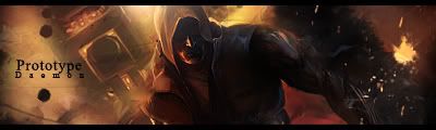
 Prototype Brighter for you. Prototype Brighter for you.
I made this today, What do you think? Should i make a tut on this?
C&C
Time to make: About 15-20 minutes
V1:
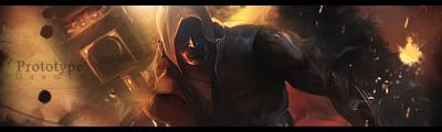
V2: Text change.

V3: Tad brighter
Last edited by Daemon; 08-16-2007 at 08:42 AM.
-
nice job
good lighting, don't like the text because it stands out so much
besides that it's a solid sig
XBOX Live Gamertag: Merc 106

-
I could lower the opacity of the text
-
yeah, i think v2 is kinda better, there is a little bit more detail in the face and the text is more prefered, u could make a good tutorial from this?
-
 Originally Posted by cameron

yeah, i think v2 is kinda better, there is a little bit more detail in the face and the text is more prefered, u could make a good tutorial from this?
Thx for commenting, i think im going to make the tut, the only thing different in V2 is the text
-
definitly make a tut, gr8 sig, cud u possibly link me to then render? i like it :P
-
I fink its little too dark...
-
I think it needs to be a little bit lighter. Just a tad bit. Right now it seems abnormally dark to me. Overall its an awesome sig and i can't see any flaws. But i think it needs lightening.
 My DevART
RATCHET is my bitch
Andrew says:
u ever stolen a bible?
Apathy says:
no
used the last two pages to roll a joint though
Andrew says:
wow
thats fucking hard core
^^HAHAHA, dm sucks XD
-
I'd sex your stuff daemon, you've moved up into my favorite sig maker spot. I like v2 just the way it is.
Tut? yesplz
-
Oh, on behalf on the entire Void, I'd like to thank you so much for contributing so much in the last few months. Your three big tuts have almost racked up 10,000 views total. Keep up the great work man.
Similar Threads
-
By DragonsRage in forum Digital Art
Replies: 2
Last Post: 11-08-2005, 06:20 PM
 Posting Permissions
- You may not post new threads
- You may not post replies
- You may not post attachments
- You may not edit your posts
-
Forum Rules
|


 Reply With Quote