GFXVoid Graphic Design Forum

Remove Text Formatting
Loading...

» Online Users: 175

0 members and 175 guests
No Members online

» Site Navigation

 > FAQ

» Stats

Members: 35,443
Threads: 103,072
Posts: 826,684
Top Poster: cc.RadillacVIII (7,429)
Welcome to our newest member, Lekelindids
Results 1 to 5 of 5

Thread: Carnage

  1. #1
    Join Date
    Mar 2007
    Location
    Cali
    Posts
    372

    Default Carnage


    c&c please.


    .

  2. #2
    Join Date
    Mar 2007
    Location
    Denmark
    Posts
    4,197

    Default

    Hmm interresting the colors are to monotone i think. But hes nice blended. All in all its a decent sig.


  3. #3

    Default

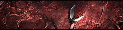
    i like this a lot the only thing i see wrong is that ur name under carnage looks like Conin
    i suggest u move the text up and make it bigger or choose another text for ur name well done

  4. #4
    Join Date
    Mar 2007
    Location
    Cali
    Posts
    372

    Default

    lol your right greek, it does look like conin. ill fix it. thnx for the coment.

  5. #5

    Default

    any time

Similar Threads

  1. Spidey V. Venom V. Carnage
    By A.FIRE.INSIDE in forum Sigs & Manips
    Replies: 1
    Last Post: 02-06-2006, 10:13 AM
  2. Carnage
    By AntidotexXx in forum Sigs & Manips
    Replies: 6
    Last Post: 12-08-2005, 02:44 PM
  3. carnage
    By Chemical in forum Sigs & Manips
    Replies: 4
    Last Post: 06-29-2005, 08:45 PM
  4. Carnage
    By eLLuSioNiST in forum Sigs & Manips
    Replies: 13
    Last Post: 03-03-2005, 11:16 AM

Posting Permissions

  • You may not post new threads
  • You may not post replies
  • You may not post attachments
  • You may not edit your posts
  •  
Powered by vBadvanced CMPS v4.1.1