0 members and 684 guests
No Members online

» Site Navigation

» Stats
Members: 35,443
Threads: 103,072
Posts: 826,684
Top Poster: cc.RadillacVIII (7,429)
|
-
-

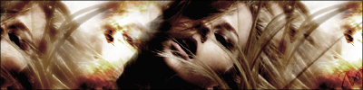
left side is kinda over contrasted slightly...
colours could also be improved...
maybe some graident maps on diffrent blending modes, photo filters, colour balance,hue/saturation, selective colours, etc?
lighting also needs work...
also looks kinda chaotic and messy on both sides...
shame, cuz I really liked your simple tags
-
yearh its a bit to messy and colors could be improven i also liked your simple tags, but its a decent job.
Similar Threads
-
By Dick in forum The Void
Replies: 7
Last Post: 05-01-2007, 12:20 PM
-
By Nightfire in forum Digital Art
Replies: 3
Last Post: 04-15-2007, 05:12 PM
-
By SuddenDarkness in forum Introductions
Replies: 7
Last Post: 11-14-2006, 05:22 AM
-
By Chivalry in forum Sigs & Manips
Replies: 2
Last Post: 08-05-2006, 03:55 PM
-
By Mr. Kenny in forum Digital Art
Replies: 6
Last Post: 12-28-2005, 06:10 PM
 Posting Permissions
- You may not post new threads
- You may not post replies
- You may not post attachments
- You may not edit your posts
-
Forum Rules
|
![[PHXN] New001's Avatar](image.php?s=e70865c9241e6d2f4b94405d78f28c50&u=7015&dateline=1264038258)
![[PHXN] New001 is offline](http://www.gfxvoid.com/forums/images/statusicon/user-offline.png)

![Send a message via AIM to [PHXN] New001](http://www.gfxvoid.com/forums/images/misc/im_aim.gif)
![Send a message via MSN to [PHXN] New001](http://www.gfxvoid.com/forums/images/misc/im_msn.gif)
![Send a message via Yahoo to [PHXN] New001](http://www.gfxvoid.com/forums/images/misc/im_yahoo.gif)


 Reply With Quote

