0 members and 2,620 guests
No Members online

» Site Navigation

» Stats
Members: 35,443
Threads: 103,072
Posts: 826,684
Top Poster: cc.RadillacVIII (7,429)
|
-

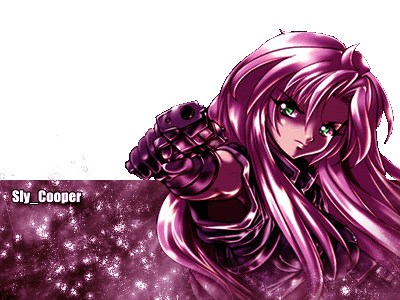
I made this new sig today.
--------
-
Its nice, but the the upper part of the stock is kinda wierd. Theres black stuff around her gun and hair.
-
Very nice and colourful and biiiig!
Yeah you didnt quite cut the picture properly
good tho 7/10
-
Yeah, I just noticed that, and I got that pic from
gamerenders.net
-
make her a little smaller but also dont fade her at the bottom. i dont like the way shes just like floating. ..
If you want help...
Screw you
If you make sigs...
Screw you
-
yup it needs to be a bit smaller... colors r good though..! :P
Keep honking. I'm reloading.
-
I really like the colors. The contrast between the green eyes and the purple just works perfect for me. It looks like some white starburst brushing went above the banner on the left there, a quick, harmless mistake really. There's not much you can do in terms of making transparency cut jobs less pixely, you can't have any anti aliasing or blending on transparancy. You could set the background color to the same color as the board, it will only work here, but would look much cleaner, while cheating the transparency system  I think it needs a 1 or 2 pixel border on the banner part of it. To add to the popping out ellusion, have the border go over the bottom of the render, but on the top and the right, let the hair and the upper body go over the border, making it seem as if she is leaning out of the banner. I think it needs a 1 or 2 pixel border on the banner part of it. To add to the popping out ellusion, have the border go over the bottom of the render, but on the top and the right, let the hair and the upper body go over the border, making it seem as if she is leaning out of the banner.
-
yeah, you could have blended the render better over the transparent part ,and it maybe goes up too high ? :/ , don't know. The render fits very well with the bg, but the brushing looks a little bit out of focus, like pixels :/ quite good job though, keep it up.
-
If you don't want that it is pixelate, just safe him as .PNG
Looks much better and png's also can hit transparency. 
-
i must say, very big, and a little choppy, other than that its good, maybe blue the background a little bit (very little)
 Posting Permissions
- You may not post new threads
- You may not post replies
- You may not post attachments
- You may not edit your posts
-
Forum Rules
|


 Reply With Quote


