GFXVoid Graphic Design Forum

Remove Text Formatting
Loading...

» Online Users: 1,966

0 members and 1,966 guests
No Members online

» Site Navigation

 > FAQ

» Stats

Members: 35,443
Threads: 103,072
Posts: 826,684
Top Poster: cc.RadillacVIII (7,429)
Welcome to our newest member, Lekelindids
Results 1 to 10 of 10

Thread: Bleak Entry

  1. #1
    Join Date
    Aug 2007
    Location
    Philippines \m/
    Posts
    331

    Default Bleak Entry

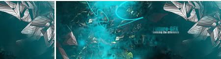
    Latest work [09 . 18 . 07]
    made for softw theme "Bleak"


    comments appreciated ;D
    Last edited by +mw.kira; 09-20-2007 at 08:44 AM.


    Proud Member Of MasterWorks® Family

  2. #2
    Join Date
    Aug 2007
    Location
    Philippines \m/
    Posts
    331

    Default

    Waiting for c&c XD


    Proud Member Of MasterWorks® Family

  3. #3
    Join Date
    Dec 2005
    Location
    The Netherlands
    Posts
    663

    Default

    too empty
    6

  4. #4
    Join Date
    Jun 2007
    Location
    Malaysia
    Posts
    568

    Default

    it's too wide

  5. #5
    Join Date
    Mar 2007
    Location
    Denmark
    Posts
    4,197

    Default

    Hmm i would like it if ot was just the rose but i understand you have to take in the praying girl. decent job


  6. #6
    Join Date
    Aug 2007
    Location
    Philippines \m/
    Posts
    331

    Default

    Thnx for the comments ;D
    I also think it's wide lol but i don't have time to resize it XD


    Proud Member Of MasterWorks® Family

  7. #7
    Join Date
    Aug 2007
    Posts
    25

    Default

    You have two focal points,the rose and that girl...
    And I think you could use more details...
    Other than that,it's a decent job...

    Live today to fight tomorrow
    NEWEST


  8. #8
    Join Date
    Jan 2007
    Location
    Minnesota
    Posts
    5,091

    Default

    Brahma its not bad. It needs a little bit morein the BG. ALso like DEvon said only have one focal point.

    Also I think this sig could benifit a lot by having more use with the Rule of Thirds. If you don't know what the rule of thirds is, Read this, it shows the rule of thirds really well (even though it is for photography it can apply for all art).

    http://digital-photography-school.co...ule-of-thirds/

    SO maybe just move the girl off the side and moe towards teh middle but not directy in the middle. ANyways its pretty good.


    My DevART
    RATCHET is my bitch
    Andrew says:
    u ever stolen a bible?
    Apathy says:
    no
    used the last two pages to roll a joint though
    Andrew says:
    wow
    thats fucking hard core
    ^^HAHAHA, dm sucks XD


  9. #9
    Join Date
    Aug 2007
    Location
    Philippines \m/
    Posts
    331

    Default

    thnx paparok, lol


    Proud Member Of MasterWorks® Family

  10. #10
    Join Date
    Jul 2007
    Posts
    417

    Default

    The girl looks seriously out of place...
    Either remove her, or move her to the center, cuz atm you have two focals...
    Also get rid of the thunder....
    Colours look nice and fit the signature...
    Decent tag IMO but could e improved

Posting Permissions

  • You may not post new threads
  • You may not post replies
  • You may not post attachments
  • You may not edit your posts
  •  
Powered by vBadvanced CMPS v4.1.1