GFXVoid Graphic Design Forum

Remove Text Formatting
Loading...

» Online Users: 4,870

0 members and 4,870 guests
No Members online

» Site Navigation

 > FAQ

» Stats

Members: 35,443
Threads: 103,072
Posts: 826,684
Top Poster: cc.RadillacVIII (7,429)
Welcome to our newest member, Lekelindids
Results 1 to 3 of 3

Thread: A new one =)

  1. #1

    Default A new one =)


    CnC and rank?

  2. #2
    Join Date
    Dec 2005
    Location
    The Netherlands
    Posts
    663

    Default

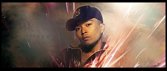
    not likin' the darker left side and also, I have to try my best to read the text clearly
    It's somewhat empty
    6

  3. #3
    Join Date
    Mar 2007
    Location
    Denmark
    Posts
    4,197

    Default

    well as rai already pointed out the dark sites on left isnt so good. and the text dont lower the opacity so much. other than that great job here. nice bg and nice effect blending.


Posting Permissions

  • You may not post new threads
  • You may not post replies
  • You may not post attachments
  • You may not edit your posts
  •  
Powered by vBadvanced CMPS v4.1.1