0 members and 386 guests
No Members online

» Site Navigation

» Stats
Members: 35,443
Threads: 103,072
Posts: 826,684
Top Poster: cc.RadillacVIII (7,429)
|
-
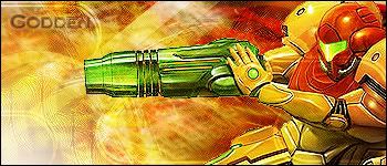
 Firey :D Firey :D
firey  c+c plz c+c plz

Update after c+c
Last edited by Godden; 09-27-2007 at 01:11 AM.
-
Your other sig was better.
What is your focal point? The G or the render? My eyes want to look at the render, but it isn't sharpened enough so they look at the G.
The render doesn't look like it even belongs that.
Try making your text smaller.
Your bg has like nothing going on, it's like, just there.

"Judge a man by his questions,
not his answers."
-Voltaire
-
The render doesnt fit what so ever, the colors need better work they dont match, the light sorce should be a little smaller, the teaxt needs to be better, and the render needs a little better blending.
-
 Originally Posted by tunafish69

Your other sig was better.
What is your focal point? The G or the render? My eyes want to look at the render, but it isn't sharpened enough so they look at the G.
The render doesn't look like it even belongs that.
Try making your text smaller.
Your bg has like nothing going on, it's like, just there.
I must agree here cuz the g stands ut way to much the render is to blurred.
Similar Threads
-
By Shadow in forum Digital Art
Replies: 0
Last Post: 03-12-2007, 09:45 PM
-
By Chivalry in forum Sigs & Manips
Replies: 2
Last Post: 08-04-2006, 05:56 PM
-
By *Peng* in forum Sigs & Manips
Replies: 4
Last Post: 11-04-2005, 02:37 PM
-
By Zeyne in forum Digital Art
Replies: 4
Last Post: 06-19-2005, 03:59 PM
 Posting Permissions
- You may not post new threads
- You may not post replies
- You may not post attachments
- You may not edit your posts
-
Forum Rules
|


 Reply With Quote


