GFXVoid Graphic Design Forum

Remove Text Formatting
Loading...

» Online Users: 3,594

0 members and 3,594 guests
No Members online

» Site Navigation

 > FAQ

» Stats

Members: 35,443
Threads: 103,072
Posts: 826,684
Top Poster: cc.RadillacVIII (7,429)
Welcome to our newest member, Lekelindids
Page 1 of 2 12 LastLast
Results 1 to 10 of 15
  1. #1
    Join Date
    Jun 2007
    Posts
    129

    Default Halo 3 C.Q.B Check it out

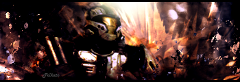
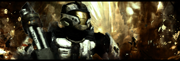
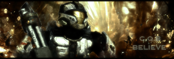
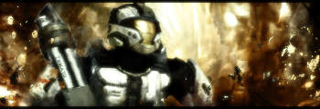
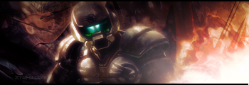
    I was trying to combine jus tabout everything I know into this sig and it came out really bad I'm really mad about that I've been doin sigs for like 7+months now goin on and off takin like 2week breaks or a month or whatever but still I cant create one damn sig that doesn't look noob. The text on it is bad but I just felt like putting it there is one without the text too. Also there is one without text and the gausion blur.


    :Latest:
    :Favorite:

  2. #2
    Join Date
    Sep 2007
    Location
    Under your bed.
    Posts
    95

    Default

    [Please don't rate signatures unless asked to, thank you!] , I'd tap that.
    Last edited by Roy; 10-04-2007 at 07:42 PM.

  3. #3

    Default

    too blurred, render isnt blended
    New


    Old


  4. #4
    Join Date
    Aug 2007
    Location
    Philippines \m/
    Posts
    331

    Default

    one thing,.. blury lol
    V3 one's the best tho!


    Proud Member Of MasterWorks® Family

  5. #5
    Join Date
    Jun 2007
    Posts
    129

    Default

    Everyone keeps saying it's blurry! V3 is not blurry at all on my comp unless I'm going blind....I'll try to fix it though <.< As for blending it kinda sorta is but not really so I'll get to that after school
    :Latest:
    :Favorite:

  6. #6
    Join Date
    Mar 2007
    Location
    Oslo, Norway
    Posts
    1,509

    Default

    I like it.. exept the very visible whit thingy on the right side

    Formerly known as silentshadow
    http://flickr.com/aeilertsen

  7. #7
    Join Date
    Jun 2007
    Posts
    129

    Default

    What do you mean by the white thingy?

    BTW I'm almost done with my revisions
    :Latest:
    :Favorite:

  8. #8
    Join Date
    May 2007
    Posts
    379

    Default

    I have no clue what's wrong with it, I just don't like it =/

    "Judge a man by his questions,
    not his answers."
    -Voltaire


  9. #9
    Join Date
    Mar 2007
    Location
    Oslo, Norway
    Posts
    1,509

    Default

    Uhm... Like the "solid" whit spots on the right side... kinda hard to explain x)

    Formerly known as silentshadow
    http://flickr.com/aeilertsen

  10. #10
    Join Date
    Jun 2007
    Posts
    129

    Default

    Hmm not good for self-esteem xD here is V2

    :Latest:
    :Favorite:

Similar Threads

  1. once again AJ, check it out...
    By sunshiine in forum Sigs & Manips
    Replies: 5
    Last Post: 01-10-2007, 12:13 PM
  2. Check This Out
    By TSM in forum Sigs & Manips
    Replies: 5
    Last Post: 02-05-2006, 04:00 AM
  3. New Sig - Check it out.
    By Gurdev in forum Sigs & Manips
    Replies: 3
    Last Post: 03-25-2005, 01:09 AM

Posting Permissions

  • You may not post new threads
  • You may not post replies
  • You may not post attachments
  • You may not edit your posts
  •  
Powered by vBadvanced CMPS v4.1.1