0 members and 1,063 guests
No Members online

» Site Navigation

» Stats
Members: 35,443
Threads: 103,072
Posts: 826,684
Top Poster: cc.RadillacVIII (7,429)
|
-
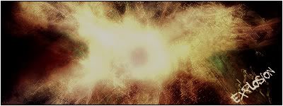
 explosion explosion
cNc
-
this one is a bit to dark should try to lighten it up some
-
I like the concept but it still needs some a bit boring right now.
-
Kinda boring, kinda dark, some colors are missing its only one here, but its not bad... 
-
yep, kinda dulled down to be an explosion. Add contrast plzkthnx. Or something.
-
yeah... i also saw that you lowered the opacity to unbrighten the colors, but see.. you shouldnt do that, it makes the colors lose their luminosity and actual colors, try adding a adjustment layer instead
:Latest:

:Favorite:

-
actually originally the colors were red and bluish green, but at the end it really didnt give the color effect i wanted, so i used some gradient maps and got that ( if u look closley u can see the red outlines the explosion, an there are spots of the bluegreen in areas )
Similar Threads
-
By konfusion in forum Digital Art
Replies: 6
Last Post: 12-14-2006, 01:30 PM
-
By Adam in forum Sigs & Manips
Replies: 4
Last Post: 01-16-2006, 01:22 PM
-
By robgasm in forum Digital Art
Replies: 21
Last Post: 06-29-2005, 11:02 AM
-
By bsq in forum Digital Art
Replies: 7
Last Post: 04-18-2005, 09:53 AM
-
By Oblivion in forum Digital Art
Replies: 21
Last Post: 04-10-2005, 09:59 AM
 Posting Permissions
- You may not post new threads
- You may not post replies
- You may not post attachments
- You may not edit your posts
-
Forum Rules
|


 |
| |
| |
| |
| |
| |
| |
|") |
|
 Reply With Quote