0 members and 3,724 guests
No Members online

» Site Navigation

» Stats
Members: 35,443
Threads: 103,072
Posts: 826,684
Top Poster: cc.RadillacVIII (7,429)
|
-
-

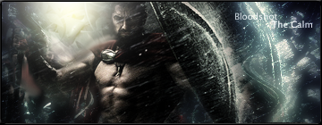
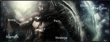
venom one and 300 one are nice but you should get rid of the random text on the 300 one.
-
=D thanks, i might when im not too lazy lol =PP, thanks for the comment =D
:Latest:

:Favorite:

-
-
You really need to work on your text. the 300 sig is decent. but you have a tense to make your light to foggy and big
-
aight yeah, i havent really understood lighting, everyone told me just use a really large soft brush with white, i dont lol know about it, and yeah.. text is difficult for me
:Latest:
:Favorite:
-
Text is horrible, either stop adding text or try to blend them (using colours from the sig).
A pure white text on a dark sig = crap
-
its not pure white, its soft lighted duplicated 6 times, it does blend a little bit, and just dismind the text then, i could use some critiquing on the rest of the sig rather than the text
:Latest:
:Favorite:
-
Well I think the text in your 2 currents is just fine. But in terms of lighting, take a large white brush and click twice where you want the light source to come from and set that layer to lighten or screen and mess with the opacity. Then take a soft brush about 1/2 the size the original brush and click once in the center of the light source and set that layer to lighten as well. This'll give it a more realistic feel.
-
almost all of them are really dark maybe make them a little lighter? just a thought
Similar Threads
-
By Sp0rk-eh in forum The Void
Replies: 35
Last Post: 02-04-2006, 02:04 AM
-
By Sp0rk-eh in forum The Void
Replies: 18
Last Post: 01-08-2006, 10:59 PM
-
By Natashead in forum Digital Art
Replies: 22
Last Post: 12-22-2005, 07:27 PM
-
By Dick in forum The Void
Replies: 17
Last Post: 11-26-2005, 10:32 AM
-
By Juicy in forum Sigs & Manips
Replies: 11
Last Post: 05-09-2005, 11:37 AM
 Posting Permissions
- You may not post new threads
- You may not post replies
- You may not post attachments
- You may not edit your posts
-
Forum Rules
|


 Reply With Quote