0 members and 1,263 guests
No Members online

» Site Navigation

» Stats

Members: 35,443
Threads: 103,072
Posts: 826,684
Top Poster: cc.RadillacVIII (7,429)
|
-
 Not been on in ages Not been on in ages
Ive done 2 sort the second ones a bit big im tryin 2 get it smaller

and

-

=\ I understand you havent done them in a very long but I have to give my brutal honest opinion =(
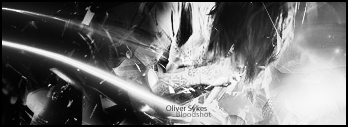
the first on BG is very very busy and blurred for some reason everything is jumbled and stuck toether and the render is nice but the BG just isnt working for me, there is no border and the text is drawing me in more than it prolly should (not to sound hypocritical i know my text needs work)
on the second the BG is also very busy, and blurred-ish the render is a cool render, again there is no border, text draws me in too much and that is way too big to be a signature =\, you also need some light sources, overall on both
2/10
2.9/10
sorry dude =( just wanna try and help
:Latest:

:Favorite:

-

ya the first sig is just to dull and blurred if you had a light source of some kinda and if the render stuck
out more it would look better. The second one i like better, if put maybe a light source on the left far corner and
then maybe did something with the ball like lighting it and fearthing in the guy i think it
would look pretty sweet. I like the bg on this one somewhat. The text is boring though
Also putting a 1 - 3 pixel border adds a good quality to sigs
-

how do u add borders i never normally put them on
-

theres a few ways you can do it, one simple way is to make a new layer, get the marquee tool and select the whole sig then right click and click on stroke.
Then width whatever you want usually 1 - 3 px will do, the color normally black
your own choice though.
There is a few other ways you can do it depending on how you made your sig if
you go to your 1st layer and go into blending options then go down to stroke,
and just do the same details, width, color but with this you can change the blending mode which can add cool effects to your sig.
once you start messing with it you will get the hang of it. hope that helps!
-

Your don't ALWAYS need borders. It's really however you think the sig will work best. Sometimes i get to the end of the sig and think it'd be better without a border so i get rid of it. Each sig is different and different things work well with different sigs.
1st sig - The text isn't bad, I would just get rid of the outer glow around it and it would be better. The bg is very busy and chaotic. next time maybe try doing a little bit less to make it a little bit easier to focus on the render.
2nd sig - the text is a bit too big and seems kind of pixelly for some reason. Also when doing text i would try to stay away from bevel as much as possible. Work on your bledning on this one a little bit. Try to overlap on top of the render a bit with the bg. The BG on this sig is fairly good, could use more saturation, but its not bad.
I would try taking a couple tuts i like these a lot and seemed to help me and a lot of other people a LOT.
Ilovecoheed's full sig tut -
http://www.gfxvoid.com/forums/showthread.php?t=16482
Deamon's pokemon tut -
http://www.gfxvoid.com/forums/showthread.php?t=26274
Deamon's dragon tut -
http://www.gfxvoid.com/forums/showthread.php?t=26281
Also if you need more help you can aim me or msn me:
andrew25says = AIM
paparoksguitar@hotmail.com - MSN
 My DevART
RATCHET is my bitch
Andrew says:
u ever stolen a bible?
Apathy says:
no
used the last two pages to roll a joint though
Andrew says:
wow
thats fucking hard core
^^HAHAHA, dm sucks XD
Similar Threads
-
By Apprentice. in forum Sigs & Manips
Replies: 2
Last Post: 02-21-2007, 11:19 AM
-
By undertone in forum Sigs & Manips
Replies: 8
Last Post: 09-02-2005, 02:06 PM
-
By undertone in forum Sigs & Manips
Replies: 10
Last Post: 05-12-2005, 10:02 PM
-
By Dale in forum Sigs & Manips
Replies: 7
Last Post: 03-04-2005, 05:31 PM
 Posting Permissions
- You may not post new threads
- You may not post replies
- You may not post attachments
- You may not edit your posts
-
Forum Rules
|


