0 members and 522 guests
No Members online

» Site Navigation

» Stats
Members: 35,443
Threads: 103,072
Posts: 826,684
Top Poster: cc.RadillacVIII (7,429)
|
-
 Ryu sig Ryu sig
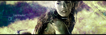
This is kinda incomplete because I wanst sure what else to do..

-----

-----
-
i like it so far, not sure about the white line coming down. get some colors going in
there and add some text and i think it would look good!
-
very nice but it looks like you have just motion blured the background a tad too much with some other stuff. Also i don't like the lines that go across the screen also the renders (for me) is blended enough.
Last edited by Drolaw; 10-27-2007 at 04:53 PM.
-
I think its pretty nice, like the other the line isnt very good, it also looks to much motion blur. maybe a lil less, could use a teency bit more blending, and it also looks like you have about 8 light sources, try and go for one that slows desaturates the rest, and text somewhere, it looks pretty cool
:Latest:

:Favorite:

-
I think you should keep the motion blur, just set it at more of an angle that seems to be in the path of where he is swinging. It just doesn't look right at the current angle. As for the white line, I'm pretty sure thats his webline, and it should be kept, just try to dim it down a bit. Otherwise gj for a WiP.
-
I think, if that isnt already, you should get like a stock of New York city at night, put it in the bg and motion blur that, but only enough where you could still tell what it is. And, personally, id put in some color balance and take down the opacity just enough to where it looks like its b/w but it also has some color.
-
I reduced the blur, tried to blend it better a long with some other things and added some text.

So how is it now...?
-----
-----
-
it looks alot better! I still think that line going down the middle should not be there at all.
if you take that out this sig will be awesome!
-
it's probably part of the render, plust it would be a pain cus you have to replace his arm.
-
ya i was thinking it was, but if he really wanted it to look at its best and had his time on his hands
then taking it out would be the best
 Posting Permissions
- You may not post new threads
- You may not post replies
- You may not post attachments
- You may not edit your posts
-
Forum Rules
|


 Reply With Quote