GFXVoid Graphic Design Forum

Remove Text Formatting
Loading...

» Online Users: 1,446

0 members and 1,446 guests
No Members online

» Site Navigation

 > FAQ

» Stats

Members: 35,443
Threads: 103,072
Posts: 826,684
Top Poster: cc.RadillacVIII (7,429)
Welcome to our newest member, Lekelindids
Results 1 to 5 of 5

Thread: Hell Lord

  1. #1
    Join Date
    Jun 2007
    Posts
    129

    Default Hell Lord

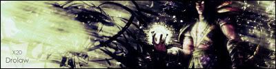
    Yeah well I literary got up this morning came over to my computer and opened up photoshop and made this signature. To me it looks a bit interesting and not the good interesting. I need to find out where the blob on the left came from cause I don't like it at all...I didn't do the lighting cause I first wanted some suggestions on where and how I should make the lighting. Lighting, Text, Depth are the three main things I need to focuss on getting better at so if anyone has any tips please do tell =D

    CnC please

    Last edited by Trikato; 10-28-2007 at 11:07 AM.
    :Latest:
    :Favorite:

  2. #2
    Join Date
    Jul 2007
    Posts
    100

    Default

    Hmm the text itself is good but it looks somewhat out of place maybe if you tried some different positioning ?
    I would put some light come from the bottom left. Just a big right of the corner or just off the centre at the bottom.
    I dont know too much about depth but maybe if you didn't blend in the render so much it might help.
    I see what you mean with the blob maybe if you tried to put a little bit of a C4 in there it would be better.

    Other than that the background if quite good and sort of give a nice liquid metal feel to it.

  3. #3
    Join Date
    May 2005
    Posts
    107

    Default

    its to dark, the render needs more light coming from it. dont like the effect you have on the bg.
    Since its so dark it doenst seem like there is much to it. The text is hard to see and i dont like the placement
    of it. Seems like you randomly placed it there

  4. #4
    Join Date
    Jun 2007
    Posts
    129

    Default

    I probably don't say this in my post with my sigs but I guess I'll say it now


    DON'T SAY ANYTHING ON THE TEXT!!!!!!!!!!!!!!!!!!!!!!!!!!!!!!!!!!!!!!!!!!!!!! !!!!!!!!!!!!!!!

    I know my text us always screwed up cause I NEVER WORK ON IT
    I just want CnC on the sig
    It's dark cause of no lighting which is what I am working on now and I said if anyone has suggestions on where or how I should put lighting into it tell me THAT'S why it's dark.
    BG is "boring" because without the lighting I didn't want to add anything else cause it would look weird
    Last edited by Trikato; 10-29-2007 at 05:11 AM.
    :Latest:
    :Favorite:

  5. #5
    Join Date
    May 2005
    Posts
    107

    Default

    To bring more light into your sig i would try and do some brushing in the dark areas
    with a red like in the top right corner, and use that effect to bring in light. Is one idea you
    could also use a big soft brush have it be white and imo place it to the left of the render
    in the dark area, and then change the blending to overlay maybe or soft light so it
    isnt this big white light.
    Just try messing with a few ways of adding a light source till you get what you want

Similar Threads

  1. Lord sesshomaru
    By nazz in forum Sigs & Manips
    Replies: 1
    Last Post: 08-03-2007, 02:22 AM
  2. hi, lord winn here!
    By lord winn in forum Introductions
    Replies: 4
    Last Post: 12-10-2005, 12:08 AM
  3. LORD FENRIR
    By Cyku in forum Sigs & Manips
    Replies: 9
    Last Post: 11-01-2005, 01:58 PM
  4. Lord of the Rings
    By HolyStar in forum Sigs & Manips
    Replies: 3
    Last Post: 09-07-2005, 11:45 AM
  5. Lord of the Gun
    By ROTD in forum Sigs & Manips
    Replies: 11
    Last Post: 07-03-2005, 02:20 PM

Posting Permissions

  • You may not post new threads
  • You may not post replies
  • You may not post attachments
  • You may not edit your posts
  •  
Powered by vBadvanced CMPS v4.1.1