0 members and 5,624 guests
No Members online

» Site Navigation

» Stats

Members: 35,443
Threads: 103,072
Posts: 826,684
Top Poster: cc.RadillacVIII (7,429)
|
-
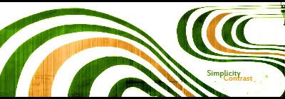
 Well, new sig Well, new sig
For this i was just practicing my Lighting :P


 [((_CRAYOLA_((]>[((_CRAYOLA_((]>[((_CRAYOLA_((]>[((_CRAYOLA_((]>[((_CRAYOLA_((]>[((_CRAYOLA_((]>
-

It's a tad too bright, not only that but good lighting is no help at all if the sig is... well bad :\. Sorry bud, I'd say get rid of the scan lines and make the lighting less and more direct. 
 My DevART
RATCHET is my bitch
Andrew says:
u ever stolen a bible?
Apathy says:
no
used the last two pages to roll a joint though
Andrew says:
wow
thats fucking hard core
^^HAHAHA, dm sucks XD
-

agreed^. As far as your actual lighting(source, shadows, etc)..its fine. Just too bright, and the rest of the sig is mehh...get rid of the scanlines, and replace em with some cool effects...clipping masks, that sort of thing.
-

I have no idea what in lords name a clipping mask is but yeah sure ^^

          
 [((_CRAYOLA_((]>[((_CRAYOLA_((]>[((_CRAYOLA_((]>[((_CRAYOLA_((]>[((_CRAYOLA_((]>[((_CRAYOLA_((]>
-

lol, maybe this'll help you..
http://photoshopcontest.com/tutorial...-mask-101.html
Thats one of many tuts for clipping masks. if you replace the gray fuzzy crap in that tut ^^^ with some cool bright colored busy stocks you can get some good stuff going.
 My DevART
RATCHET is my bitch
Andrew says:
u ever stolen a bible?
Apathy says:
no
used the last two pages to roll a joint though
Andrew says:
wow
thats fucking hard core
^^HAHAHA, dm sucks XD
-

It's pretty nice. The placement of the text is a bit awkward, and it's a tad too small. I'm also not a fan of cinematic borders, they leave the sides looking 'naked'. Good job though.
-
-

Its way to bright also dont make your light so Large the text needs to be worked on. Also remove scanlines and do more to the bg.
 Posting Permissions
- You may not post new threads
- You may not post replies
- You may not post attachments
- You may not edit your posts
-
Forum Rules
|


