0 members and 1,288 guests
No Members online

» Site Navigation

» Stats
Members: 35,443
Threads: 103,072
Posts: 826,684
Top Poster: cc.RadillacVIII (7,429)
|
-
 Babymoon. Babymoon.
Well here is a new sig from me. What do you think about this? not my greatest but not to bad. atleast i think
V1:
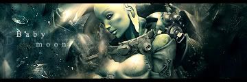
V2: (bg blurred a bit)

V3: (more blur changed text a bit)

Last edited by Daemon; 12-03-2007 at 10:01 AM.
-
I like it^^ Like totally;D
Nice blending and all^^
-
 Originally Posted by silentshadow

I like it^^ Like totally;D
Nice blending and all^^
Thx, what version do you prefer ?
-
V2 ^^ Sharp parts not to blurred, and neither too sharp^^
-
I like it a lot nice job daemon. Really thats like one of my favorite sigs from you. I like V3 the best. It flows better.
I only have one crit and that is that the text is really killing it for me. Anyway to make the baby moon part smaller and less spaces out? Maybe even blend it more?
It just really stands out almost too much. But great job i love the sig.
 My DevART
RATCHET is my bitch
Andrew says:
u ever stolen a bible?
Apathy says:
no
used the last two pages to roll a joint though
Andrew says:
wow
thats fucking hard core
^^HAHAHA, dm sucks XD
-
Ya, that deserves a tut, you should make one, I'd definately use it.

"Judge a man by his questions,
not his answers."
-Voltaire
-
V3 FTW!!!!!!!!!!!!!!
TUT THIS NOWZ!!!!! XD
This is an amazing sig you really did good on this one!
I especially like the blurr you did great job
-
Thx glad that you liked it ill think of an tut
-
I like the third one most.. maybe cause i like darker. I don't know but either way all three look nice, three just jumps out at me.
-
Great job
I would say v2, great blending 
 Posting Permissions
- You may not post new threads
- You may not post replies
- You may not post attachments
- You may not edit your posts
-
Forum Rules
|


 Reply With Quote