Its always good to try. Keep working with graphics and such. Try a couple tutorials, and stuff you'll get better

.
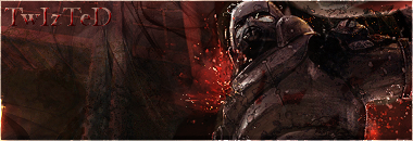
This sig is a bit too dark for me, i can't even see the render very well. Maybe lighten it up by adding a lightsource. I'd say add it to the left of the render at the top. Make a new layer, fill it black then set it to Linear dodge, then using your color picker select a bright color from one of those exploding looking things next to the render, and simply paint that color with a soft brush onto the black layer. It should brighten up the sig significantly.
I would also change the text. The bevel and emboss i am not feeling, however i aplaud you for not using outer glow
. Outerglow looks even worse and is comonly used by people new to gfx.
So yeah i would get rid of the bevel, and then change the font to a deafult windows/apple font such as arial. Try to also make it smaller. This will make it blend into the sig more and not make it stand out as much.
Finally blend yor render a bit more. You can do this by brushing overtop of him a little. Or you could add a clipping mask ontop of him in places. THe trick is to only blend him in ON THE SIDES of the render.
I reccomend trying a few tuts. I expecailly like ilovecoheed's tut. I learned a lot from it when i was starting out and it teaches a lot of good techiniques.
lol but it was made so long ago scan lines wer still cool. DOn't add them on that last step.
Daemon's tuts ae pretty good to, and i have a halo tut which isn't bad. I encourage you to try any of them.
Anyways if you need any help PM me or aim me, I'd be happy to give u some one on one help.


 Reply With Quote


