GFXVoid Graphic Design Forum

Remove Text Formatting
Loading...

» Online Users: 6,743

0 members and 6,743 guests
No Members online

» Site Navigation

 > FAQ

» Stats

Members: 35,443
Threads: 103,072
Posts: 826,684
Top Poster: cc.RadillacVIII (7,429)
Welcome to our newest member, Lekelindids
Results 1 to 5 of 5

Thread: My first try

  1. #1

    Default My first try


    I was just trying don't be to harsh please.

  2. #2

    Default

    Its not a bad start mate, Make add a nice bored and go easy with the lighting

    1 thing tho, I cannot read that test so I would make it stand out more

  3. #3

    Default

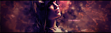
    wow for a beginner you sure did pick up a ton of lighting effects and you know to use C4D's

    big text, in sigs like this, (imo) sucks; also add some depth [im sure you can find some tutorials either here or somewhere else where they show how to add it]

    gj for a first tho
    -Latest-


    -Fave-

  4. #4
    Join Date
    Jun 2007
    Location
    Malaysia
    Posts
    568

    Default

    Lots of C4Ds, I think. It's damn bright and shiny and the text needs more improvement.

    edit: also, the border is too thick

  5. #5
    Join Date
    Mar 2007
    Location
    Denmark
    Posts
    4,197

    Default

    I would say loose some of the shiny effects they are way to strong and remove it totally on the render. instead of just using c4d's try to take some premade work and workmyou bg from there 
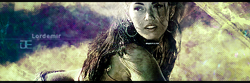
the border is a bit to thick.


Posting Permissions

  • You may not post new threads
  • You may not post replies
  • You may not post attachments
  • You may not edit your posts
  •  
Powered by vBadvanced CMPS v4.1.1