GFXVoid Graphic Design Forum

Remove Text Formatting
Loading...

» Online Users: 893

0 members and 893 guests
No Members online

» Site Navigation

 > FAQ

» Stats

Members: 35,443
Threads: 103,072
Posts: 826,684
Top Poster: cc.RadillacVIII (7,429)
Welcome to our newest member, Lekelindids
Results 1 to 3 of 3
  1. #1

    Default Beyond the Horizon


    B&W


    v2


    CnC?

  2. #2
    Join Date
    Dec 2007
    Posts
    31

    Default

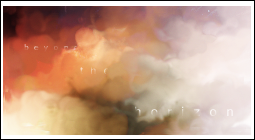
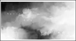
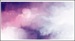
    The cloud-like effect is nice, but there's not much else. The text is quite hard to read as well. This would be a good effect for a more complex sig, but not by itself.


  3. #3

    Default

    since it says horizon, i think you should have put some sort of sun in there
    the text would also be more readable if it was in black
    -Latest-


    -Fave-

Similar Threads

  1. Team Horizon
    By Nightfire in forum Digital Art
    Replies: 2
    Last Post: 11-29-2006, 07:22 PM

Posting Permissions

  • You may not post new threads
  • You may not post replies
  • You may not post attachments
  • You may not edit your posts
  •  
Powered by vBadvanced CMPS v4.1.1