GFXVoid Graphic Design Forum

Remove Text Formatting
Loading...

» Online Users: 5,184

0 members and 5,184 guests
No Members online

» Site Navigation

 > FAQ

» Stats

Members: 35,443
Threads: 103,072
Posts: 826,684
Top Poster: cc.RadillacVIII (7,429)
Welcome to our newest member, Lekelindids
Results 1 to 9 of 9

Thread: Outcast sig

  1. #1
    Join Date
    Sep 2007
    Posts
    357

    Default Outcast sig

    New outcast sig.

    c&c please
    :Latest:

    :Favorite:

  2. #2
    Join Date
    Dec 2007
    Posts
    7

    Default

    Looks alright imo. A bit to much lighting for me/ well, white i mean.

    All over.. Its a 9/10
    :CuRReNT:

    Epidemic, GFX God. Yes. You too stu..

  3. #3
    Join Date
    Sep 2007
    Posts
    357

    Default

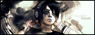
    ah i see.... most people tell me my stuff is too busy... and i kinda wanted to keep this a bit moresimplistic based on the girl and how much attention should be drawn to her... but thanks =D
    :Latest:

    :Favorite:

  4. #4
    Join Date
    Sep 2005
    Location
    manchester, UK
    Posts
    179

    Default

    This is pure awesome
    nice lighting ;]

  5. #5
    Join Date
    Jan 2007
    Location
    Minnesota
    Posts
    5,091

    Default

    Nice job! This is really good, your progressing a lot. You did awesome on the text on this, it goes great with the sig.
    If you can get rid of the orange storke around the render it kinda throws me off, and if you can't is it possible to color it the color or the bg?
    Last but not least directly right to the character you have a duplicate of the render with a low opacity, gaussian blur that just enough so you cans see the outline but it isn't so crisp. This way you will have the illusion somethign is there but wont draw your eye from the render.

    Nice job though looks really good.


    My DevART
    RATCHET is my bitch
    Andrew says:
    u ever stolen a bible?
    Apathy says:
    no
    used the last two pages to roll a joint though
    Andrew says:
    wow
    thats fucking hard core
    ^^HAHAHA, dm sucks XD


  6. #6
    Join Date
    Aug 2007
    Location
    Philippines \m/
    Posts
    331

    Default

    err man i love its depth!


    Proud Member Of MasterWorks® Family

  7. #7
    Join Date
    Oct 2006
    Location
    Sweden
    Posts
    221

    Default

    nice sig I like it! I just hate the black round spot to the left hehe sry.. really gj otherwise I think
    [
    -
    ]


  8. #8
    Join Date
    Mar 2007
    Location
    Denmark
    Posts
    4,197

    Default

    This is a killer sig loves it good bg good text and nice blend this is by far the best sig i ever seen from you m8.


  9. #9
    Join Date
    Sep 2007
    Posts
    357

    Default

    v2

    :Latest:

    :Favorite:

Posting Permissions

  • You may not post new threads
  • You may not post replies
  • You may not post attachments
  • You may not edit your posts
  •  
Powered by vBadvanced CMPS v4.1.1