GFXVoid Graphic Design Forum

Remove Text Formatting
Loading...

» Online Users: 5,698

0 members and 5,698 guests
No Members online

» Site Navigation

 > FAQ

» Stats

Members: 35,443
Threads: 103,072
Posts: 826,684
Top Poster: cc.RadillacVIII (7,429)
Welcome to our newest member, Lekelindids
Results 1 to 3 of 3
  1. #1

    Default A defined beauty


    CnC please =D
    Current


  2. #2
    Join Date
    Jul 2007
    Location
    Lithuania
    Posts
    3,611

    Default

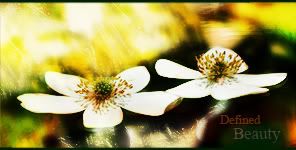
    Hmm... First look.. nice
    But I think where are too much yellow color...
    but the whole sig is nice text also very nice.
    it will be perfect to me if there wont be so much yeallow... its too bright


  3. #3
    Join Date
    Mar 2007
    Location
    Oslo, Norway
    Posts
    1,509

    Default

    Agree. Too much yellow. Apart from that: Very good job

    Formerly known as silentshadow
    http://flickr.com/aeilertsen

Similar Threads

  1. Beauty
    By VooDooRex in forum Sigs & Manips
    Replies: 7
    Last Post: 02-15-2007, 06:32 PM
  2. Beauty
    By IndoSilver in forum Sigs & Manips
    Replies: 6
    Last Post: 08-11-2005, 05:09 PM
  3. beauty
    By -Kanji- in forum Sigs & Manips
    Replies: 5
    Last Post: 06-13-2005, 06:55 PM
  4. Beauty 2
    By DragonsRage in forum Digital Art
    Replies: 9
    Last Post: 05-08-2005, 06:46 PM
  5. Beauty
    By DragonsRage in forum Sigs & Manips
    Replies: 10
    Last Post: 05-06-2005, 03:33 AM

Posting Permissions

  • You may not post new threads
  • You may not post replies
  • You may not post attachments
  • You may not edit your posts
  •  
Powered by vBadvanced CMPS v4.1.1