0 members and 3,174 guests
No Members online

» Site Navigation

» Stats
Members: 35,443
Threads: 103,072
Posts: 826,684
Top Poster: cc.RadillacVIII (7,429)
|
-
 The Endless Feed The Endless Feed
I realized how long it been since i uploaded anything and i havent uploaded anything in the new year. So i sat down and tried to do some c4d, im still a noob at this and im not too good on the postwork either but anyway what do you think? : but anyway what do you think? :
Endless Feed v1:
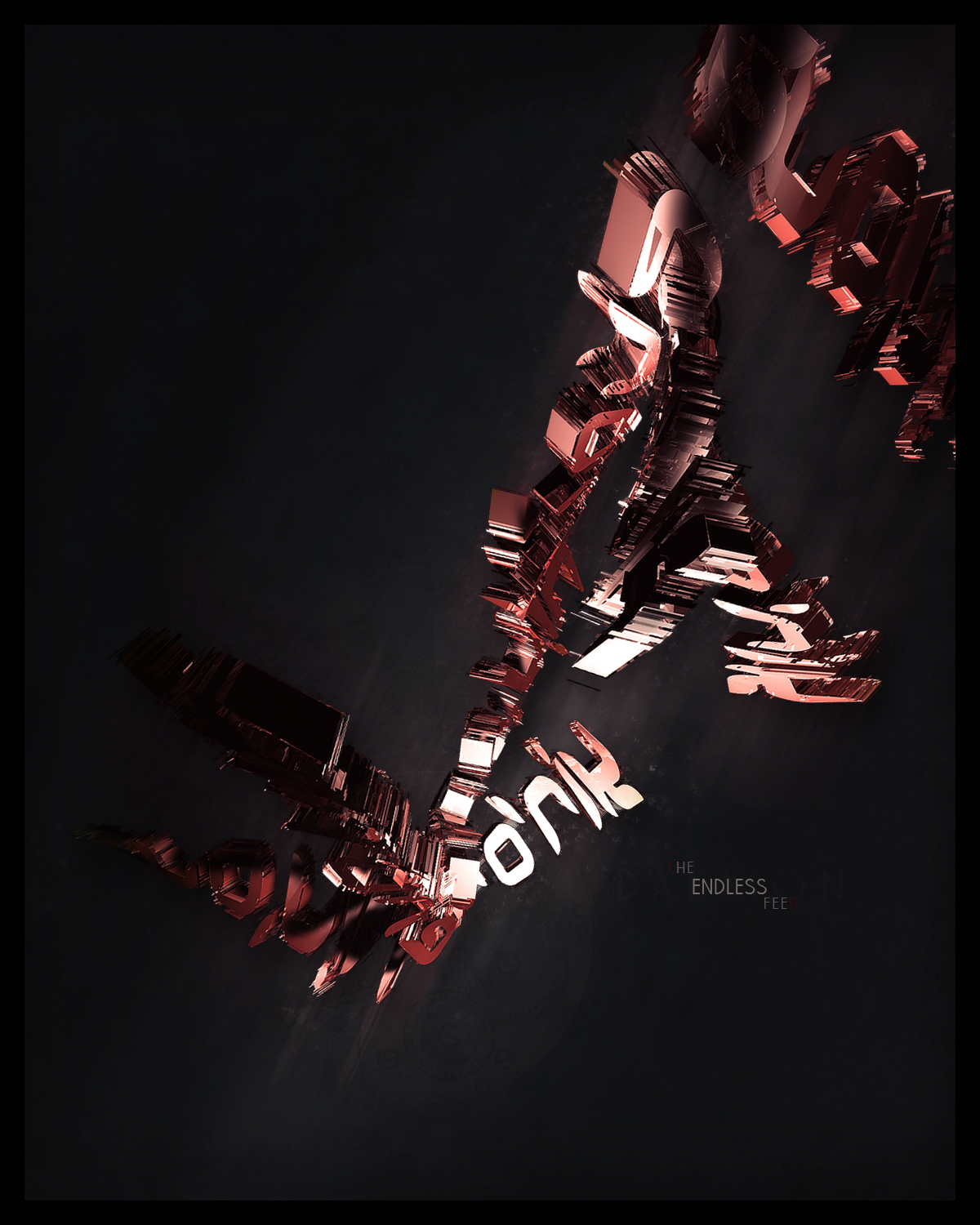
Version 2 and the b&w version is on my Deviant art. Also smaller wiew
http://daemongfxvoid.deviantart.com/
C&C pls
Last edited by Daemon; 01-13-2008 at 02:38 PM.
-
Fep, so big and purty. Lol. I don't know really what to say about it.
Oh, and you need to empty your PM box btw. Lol.
-
Looks awesome.
My only complaint is that I couldn't see the "T" in "The" and the "D" in "Feed".
It might just be my screen though.
-
Yea, thats what was bugging me. Lighten the red up, on the "T" and "D".
-
 Originally Posted by Winston

Fep, so big and purty. Lol. I don't know really what to say about it.
Oh, and you need to empty your PM box btw. Lol.
Done i didnt get one from you?
Originally Posted by VoodooGypsy
Looks awesome.
My only complaint is that I couldn't see the "T" in "The" and the "D" in "Feed".
It might just be my screen though.
Thx okay i might gonna light those up
-
-
-
I kinda like it, decent model
The composition isnt too great, and its quite monotone with little blending
Reasonably nice though, good work.
-
Very sexy. Once the red on the T and D is fixed, it will be better.
Lovin' the lighting.
   Religion gives nothing in life, only in death.
-
Similar Threads
-
By masokist in forum Digital Art
Replies: 2
Last Post: 11-27-2005, 12:25 AM
-
By 15420 in forum Sigs & Manips
Replies: 5
Last Post: 08-07-2005, 07:46 AM
 Posting Permissions
- You may not post new threads
- You may not post replies
- You may not post attachments
- You may not edit your posts
-
Forum Rules
|


 Reply With Quote


![[PHXN] New001's Avatar](image.php?s=7c2cc179d1d160ec5a682aadc902f4f6&u=7015&dateline=1264038258)
![Send a message via Yahoo to [PHXN] New001](http://www.gfxvoid.com/forums/images/misc/im_yahoo.gif)

