0 members and 8,518 guests
No Members online

» Site Navigation

» Stats

Members: 35,443
Threads: 103,072
Posts: 826,684
Top Poster: cc.RadillacVIII (7,429)
|
-
 Halo 3 | CnC Halo 3 | CnC
Alright, here's my latest. CnC please.

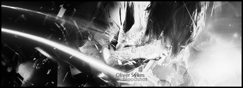
My Current:

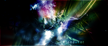
My Latest:

---------------------
"He who cannot be defeated will not be defeated."
"The only easy day was yesterday."
---------------------
- Proud Father
- Proud Member of 4th Dimension Gaming
-
-

Let me put this out there and maybe you all can give an even better CnC on my sigs.
When you say stuff like "stock", "c4d", "blend", "grunge", and stuff like that... it's safe to assume you're speaking words I don't yet fully understand, if I understand any of it to begin with.
These sigs I make... I make them without any tutorials, no help from "experienced" artits, etc. I simply open up PSCS2 and mess around with a whole lot of options to see what exactly does what. Sometimes it works out great, sometimes it works out alright, and sometimes I make something that should be burnt lol.
Anyway, that's my background with photoshop and it's terms...
Don't get me wrong, I appreciate any CnC that I get... but some of these terms... I simply look at, read, and say "ok, sure. What's that mean?"
My Current:

My Latest:

---------------------
"He who cannot be defeated will not be defeated."
"The only easy day was yesterday."
---------------------
- Proud Father
- Proud Member of 4th Dimension Gaming
-
-

alright....so basically to me this looks like an image thrown on to a liquified background of silver and black with some pretty interesting text...
Jee...I dont really know what to start, cuz nothing really makes a great sig, its all perspective...but anyhow heres what i think
I think you should try checking out some of the tuts here and learning some of the techniques that add depth, lighting, interesting backgrounds, fixing your text, overall making the sig look very interesting.
Uhm, first off
Blending, blending adds depth and all that jazz man you can learn alot about blending just by asking around people on how to do certain stuff, also taking the tuts
lighting: lighting also adds depth, along with blending, it adds more interesting points to your work.
theres sooooo many more factors but i do not have the memory nor the patience to write them all out but i will tell u this
Just ask around and talk to people, look at others work and talk to people about it, take the tuts on here....
all you gotta do really to find out stuff
Talk to senior membors on this area that know their way around here
the shoutbox is a great tool that u need to learn how to use if u want to grow.
:Latest:

:Favorite:

-

I dont want to be to harsh, but the bg seems to filtered and lifeless, i would add some color to get some more movement in it. Also you need to add some depth try to make a new layer and go image apply image then go filter blur gaussian blur. 1-2 px and then erase over the render, after that darken the sides a bit. The text is just to big and dont fit the bg try some default fonts. I would recommend you to read some tutorials, just to get a hang on some techniques
Similar Threads
-
By Trikato in forum Sigs & Manips
Replies: 11
Last Post: 08-19-2007, 06:18 PM
-
By Blitz in forum Sigs & Manips
Replies: 2
Last Post: 09-10-2006, 01:14 PM
-
By danielsaso in forum Sigs & Manips
Replies: 2
Last Post: 08-08-2006, 01:41 PM
-
By *JFM* in forum Sigs & Manips
Replies: 6
Last Post: 06-14-2006, 10:30 PM
-
By Echo in forum Sigs & Manips
Replies: 0
Last Post: 09-04-2005, 08:21 PM
 Posting Permissions
- You may not post new threads
- You may not post replies
- You may not post attachments
- You may not edit your posts
-
Forum Rules
|


