GFXVoid Graphic Design Forum

Remove Text Formatting
Loading...

» Online Users: 2,441

0 members and 2,441 guests
No Members online

» Site Navigation

 > FAQ

» Stats

Members: 35,443
Threads: 103,072
Posts: 826,684
Top Poster: cc.RadillacVIII (7,429)
Welcome to our newest member, Lekelindids
Results 1 to 4 of 4

Thread: Abyss

  1. #1
    Join Date
    Dec 2007
    Location
    WeHa
    Posts
    4

    Default Abyss

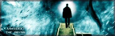
    Latest one, not that there were any before. Please tell me what you think.
    edit: changed the font around and lowered the opacity


    Last edited by matt890; 01-24-2008 at 06:05 PM.


  2. #2
    Join Date
    Jul 2007
    Posts
    1,098

    Default

    pretty cool, that's a nice concept.
    Only thing I don't like is the smudging to either side of the "stairs".
    Text could use some work too, it's a little big.


  3. #3
    Join Date
    Mar 2007
    Location
    Denmark
    Posts
    4,197

    Default

    The text stands out to much, i like this one its a good concept, but the bg just seems monotone and brushed, try to do it again and make some more details, dont quit know what but the bg just throws it off for me


  4. #4
    Join Date
    Dec 2007
    Location
    WeHa
    Posts
    4

    Default

    Thanks guys, Ill play with some colors and maybe change the bg around a little


Similar Threads

  1. Welcome to the Abyss
    By Ravon in forum Sigs & Manips
    Replies: 2
    Last Post: 04-30-2006, 10:25 AM
  2. The River Of Oblivion VS The Burning Of The Abyss
    By Daemon_ in forum Digital Art
    Replies: 18
    Last Post: 12-20-2005, 03:51 PM
  3. Abyss
    By DesiTitan in forum Digital Art
    Replies: 12
    Last Post: 05-23-2005, 10:59 PM
  4. Abyss
    By Daemon_ in forum Digital Art
    Replies: 4
    Last Post: 02-27-2005, 07:21 AM

Posting Permissions

  • You may not post new threads
  • You may not post replies
  • You may not post attachments
  • You may not edit your posts
  •  
Powered by vBadvanced CMPS v4.1.1