GFXVoid Graphic Design Forum

Remove Text Formatting
Loading...

» Online Users: 3,609

0 members and 3,609 guests
No Members online

» Site Navigation

 > FAQ

» Stats

Members: 35,443
Threads: 103,072
Posts: 826,684
Top Poster: cc.RadillacVIII (7,429)
Welcome to our newest member, Lekelindids
Results 1 to 4 of 4
  1. #1
    Join Date
    Mar 2007
    Location
    Denmark
    Posts
    4,197

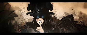
    Default First sig in 2008

    Well i havent done any in a time, and then i though it would be fun trying to make a sprite one. This is my 3rd sprite sig ever so pls cnc i know this isnt a gooad as some of my old ones, but i am having so many troubels on sprites and also the text bugs me but i dont have any ideas :


  2. #2
    Join Date
    Jan 2007
    Location
    Minnesota
    Posts
    5,091

    Default

    This isn't bad. the coloring needs a lot of work. The red and blue dots, though they are cool i don't think you should put red AND blue. Imo get rid of the red all together and change it to blue. You already have enough red in the face of the sprite. Thats my opinion though.

    Bg is perfect and the blending is alright. The text could use a lot of work. I try to use eurose and arials and stuff as much as i can. I know what you used is a default however I'm not feeling it for this sig.

    Also if you get rid of the red ball i would change the text color from red to blue as well. Mainly because that will focus less attention to it (red attracts more than any other color) and also it will go together.

    It's definetly not bad though for a sprite sig. In all of my GFX i have never even ONCE done a sprite sig...never will.


    My DevART
    RATCHET is my bitch
    Andrew says:
    u ever stolen a bible?
    Apathy says:
    no
    used the last two pages to roll a joint though
    Andrew says:
    wow
    thats fucking hard core
    ^^HAHAHA, dm sucks XD


  3. #3

    Default

    agreed, colors are a bit off. maybe a b/w version?
    also, i personally would add a c4d to the left side and blur it, maybe burn it a little for depth. i think text would be fine in a b/w

  4. #4
    Join Date
    Jul 2007
    Posts
    1,098

    Default

    yea, i think Soggy is right on the B/W version.
    I think that would look very good.

    other than that I would agree with Papa on the colors and the red text just stands out too much.

    Cool BG though.


Similar Threads

  1. | 2008 Porsche Design Edition 1 | NFS
    By harmv1234 in forum Digital Art
    Replies: 1
    Last Post: 09-30-2007, 05:29 AM

Posting Permissions

  • You may not post new threads
  • You may not post replies
  • You may not post attachments
  • You may not edit your posts
  •  
Powered by vBadvanced CMPS v4.1.1