0 members and 5,806 guests
No Members online

» Site Navigation

» Stats
Members: 35,443
Threads: 103,072
Posts: 826,684
Top Poster: cc.RadillacVIII (7,429)
|
-
 demon demon
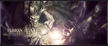
ok, last few have recieved luke warm reviews..any better with this..
Quickest sig I have made so who knows how it will go over..lol..
Last edited by Tooms; 02-27-2008 at 10:30 PM.
-
Not bad I like it.
I like the text TOOMS, good border,
maybe too bright the light..
I dont like the text Fusion Force
I recommanedate you to use some gradien map here, it really can improve you work
also you need to add more details here... not much of the in the right side.,
-
good colors..
dont use outer glow and NEVER use bevel & emboss..
renders face is too blurred
the depth: the bg is same blur overall and, it should vary
also, imo, remove the lens flare
Last edited by Bloodtears; 02-28-2008 at 01:56 PM.
GARIS - SILENTSHADOW - DAEMON
PAPA - JORRNE - GOAT -IMMORTAL_TEKNIQUE
-
I did use a numebr of Gradient maps...luv using them
and I didnt use B & E in the text at all. I thought the outer glow wentwith sig
and I wish i could sharpen the focal more. Did twice already. Cant do anymore without distortion.
But depth could be added more you are right
-
yea, i think cut the blur some on the effects to the left and right of the demon.
-
any better? worse?

-
well, if you can't sharpen the render any more, I would suggest picking another one..
GARIS - SILENTSHADOW - DAEMON
PAPA - JORRNE - GOAT -IMMORTAL_TEKNIQUE
-
sides are to blurry, but other than that i love it.. i wanna see a tut for that plz
new 
fav 
-
i htink it looks pretty nice..good job man
Similar Threads
-
By maniac___ in forum Digital Art
Replies: 0
Last Post: 04-03-2006, 05:49 AM
-
By maniac___ in forum Digital Art
Replies: 3
Last Post: 02-21-2006, 10:24 PM
-
By Umbee in forum Sigs & Manips
Replies: 2
Last Post: 10-31-2005, 11:32 PM
-
By ZeKayeM in forum Digital Art
Replies: 4
Last Post: 03-27-2005, 04:34 PM
-
By Nightfire in forum Sigs & Manips
Replies: 4
Last Post: 03-05-2005, 08:26 AM
 Posting Permissions
- You may not post new threads
- You may not post replies
- You may not post attachments
- You may not edit your posts
-
Forum Rules
|


 Reply With Quote


